 |
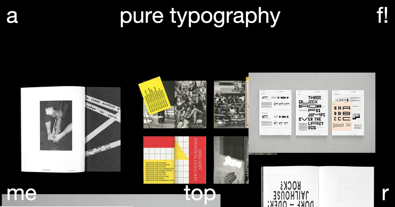
| This similar example was featured in my research. It features buttons that link to the designer's portfolio and other social media, a = archive, r = random. |
 |
| Another similar example I featured in my research, this page does not offer any buttons which does simplify the page however the UX is effected, a user would have to leave the page to find links, archive and there is no 'Random post' option. |
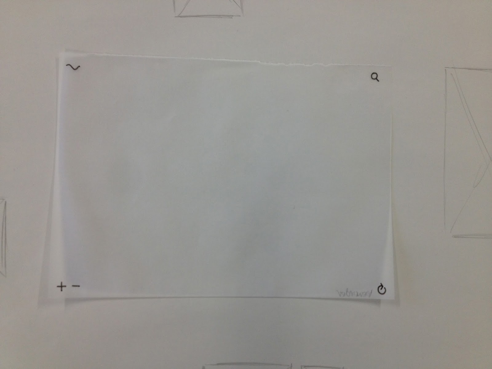 |
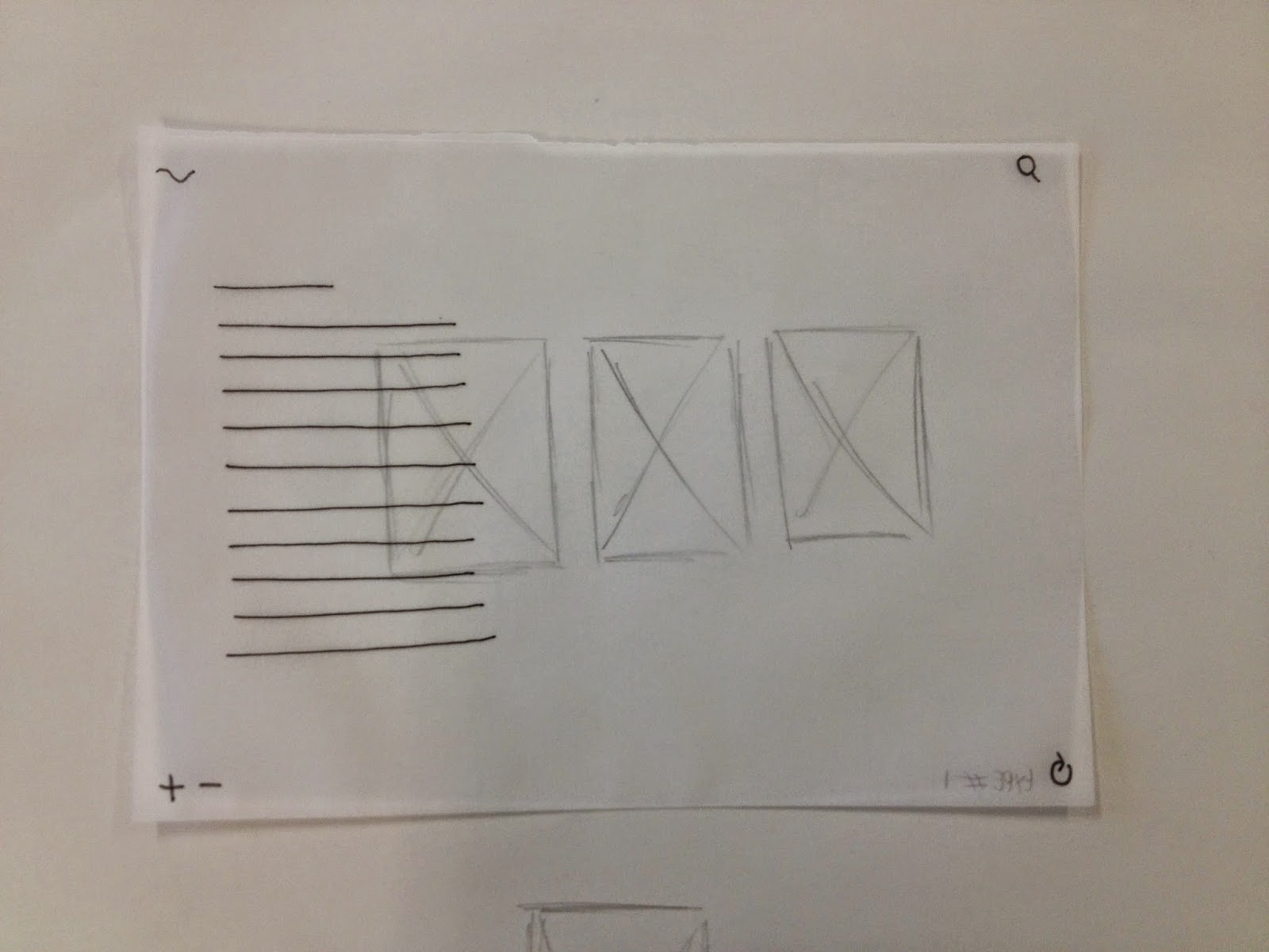
I developed the thumbnail onto tracing paper to imitate the 'window' we view a website through.
I added layers to this 'window' to imitate possible functions. |
 |
I believe this method of viewing is the most effective in relation to my content, a curation of the contemporary graphic design. Images can be seen alone or the whole page can become awash with images with the zoom option, meeting the needs of this 'ADD' Generation without compromising a potential relaxing experience (Persona needs).
|
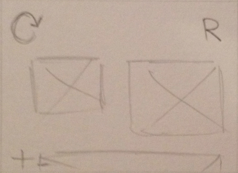
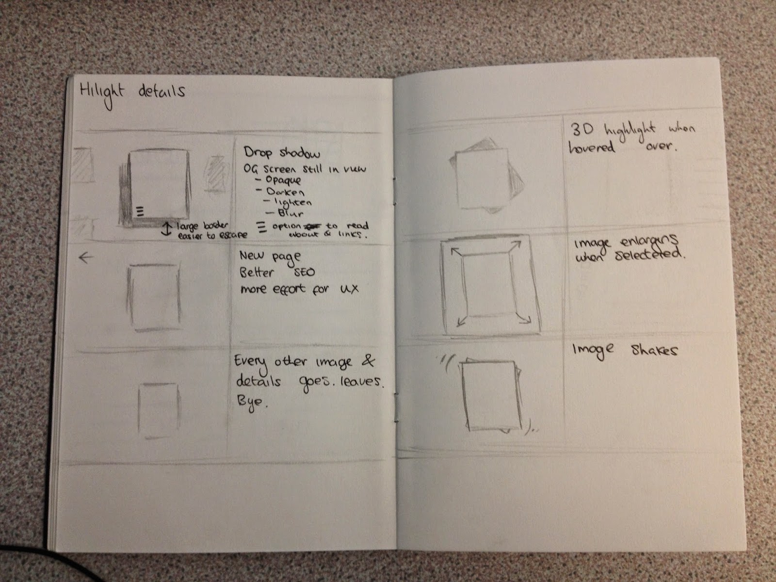
Highlight Options
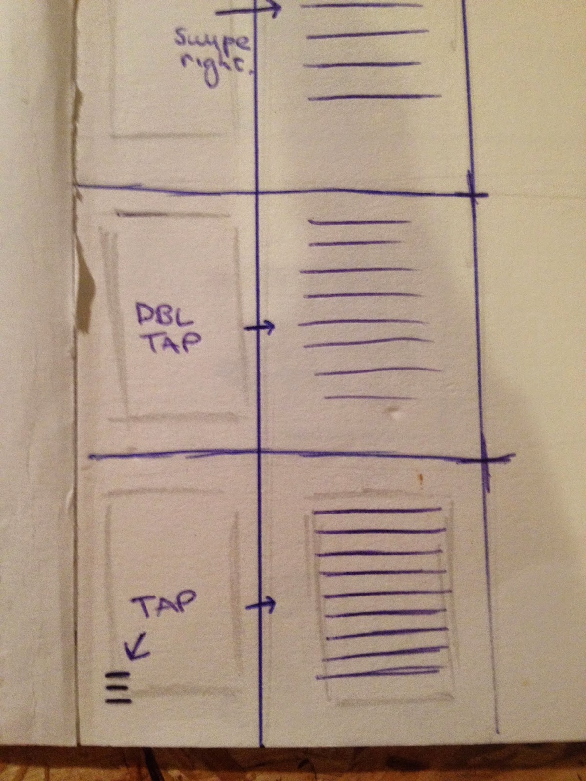 |
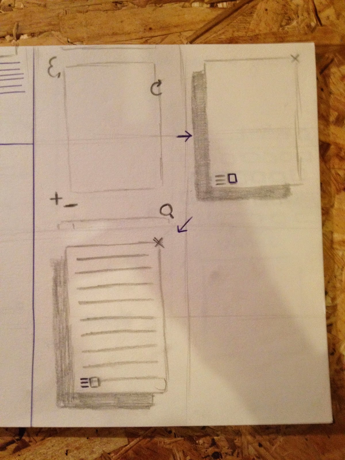
| User interaction when selecting an image, I want to make it possible for a user to highlight an individual image or photoset to view in the best possible manner, little distraction and with ease. The three options above include moving the image to the left (On mobile: swipe right), Double clicking (On mobile: double tapping) and clicking a text icon located around the image. |
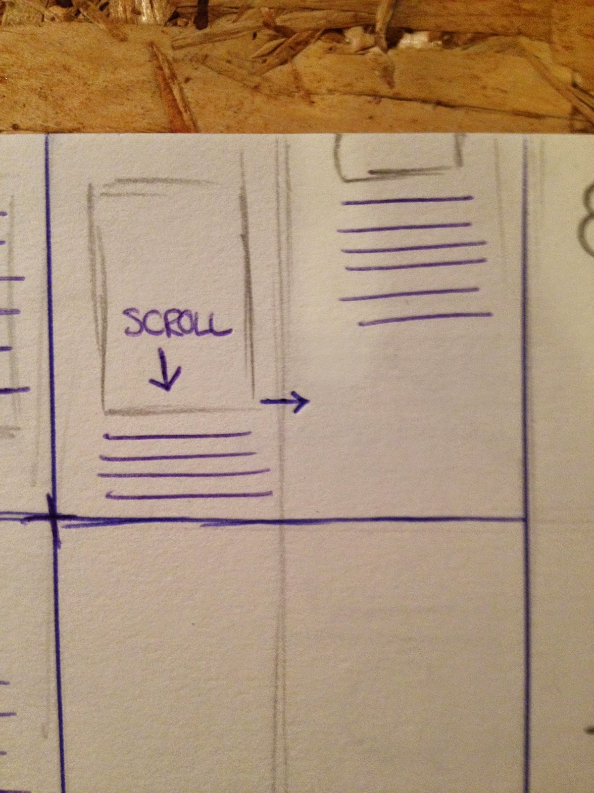 |
| An option to scroll down the page to view copy under the image. |
 |
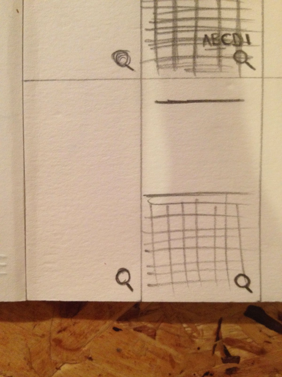
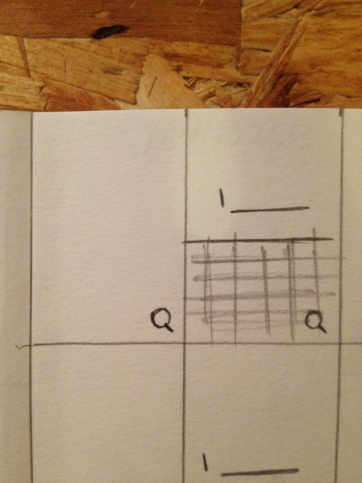
| Search options: When searching, both images and articles may be returned, viewing the results by these two categories could be done by selecting icons. |
 |
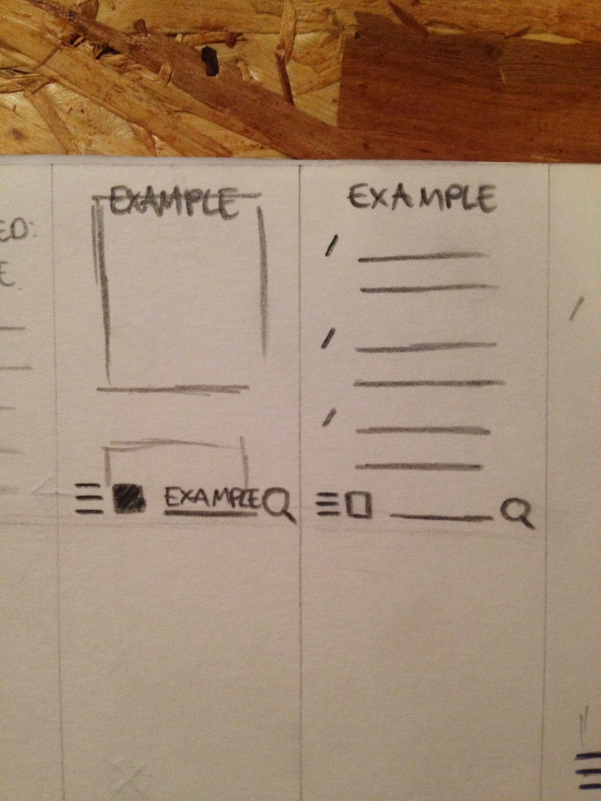
| Development of the ability to select an image or text icon. |
 |
| On mobile, there are limited options when searching as half of the screen is taken by the keypad. Here the search bar is located at the top of the page. |
 |
| On mobile, there are limited options when searching as half of the screen is taken by the keypad. Here the search bar is located at the bottom of the page. |
|
 |
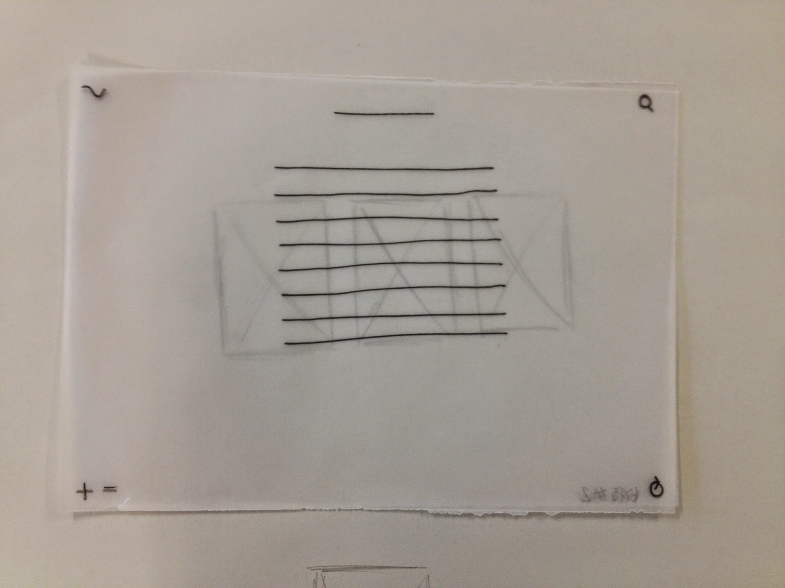
| Highlight with annotations. |
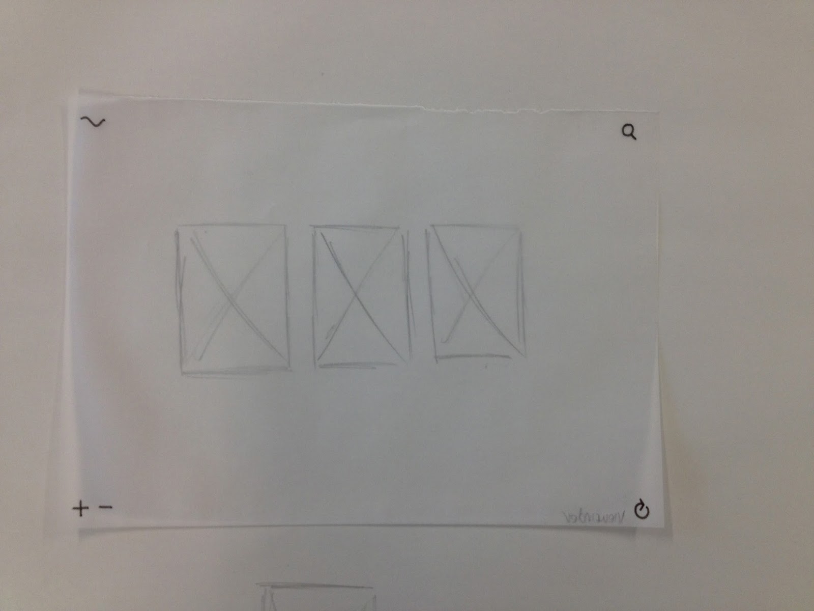 |
| The option for numerous images to be seen within one frame at once. |
 |
| Centred text over image. |
 |
| Left aligned text over image. |
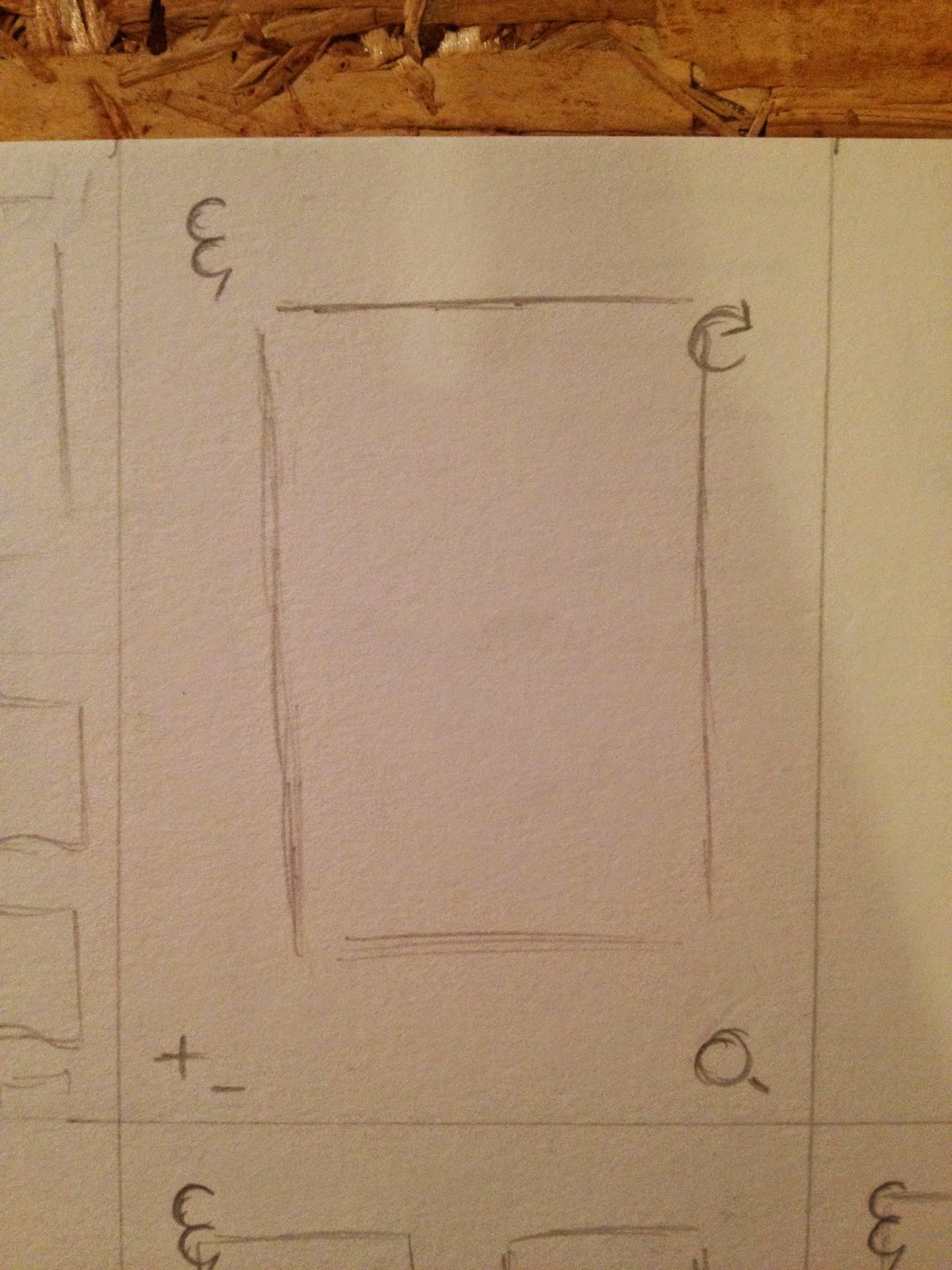 |
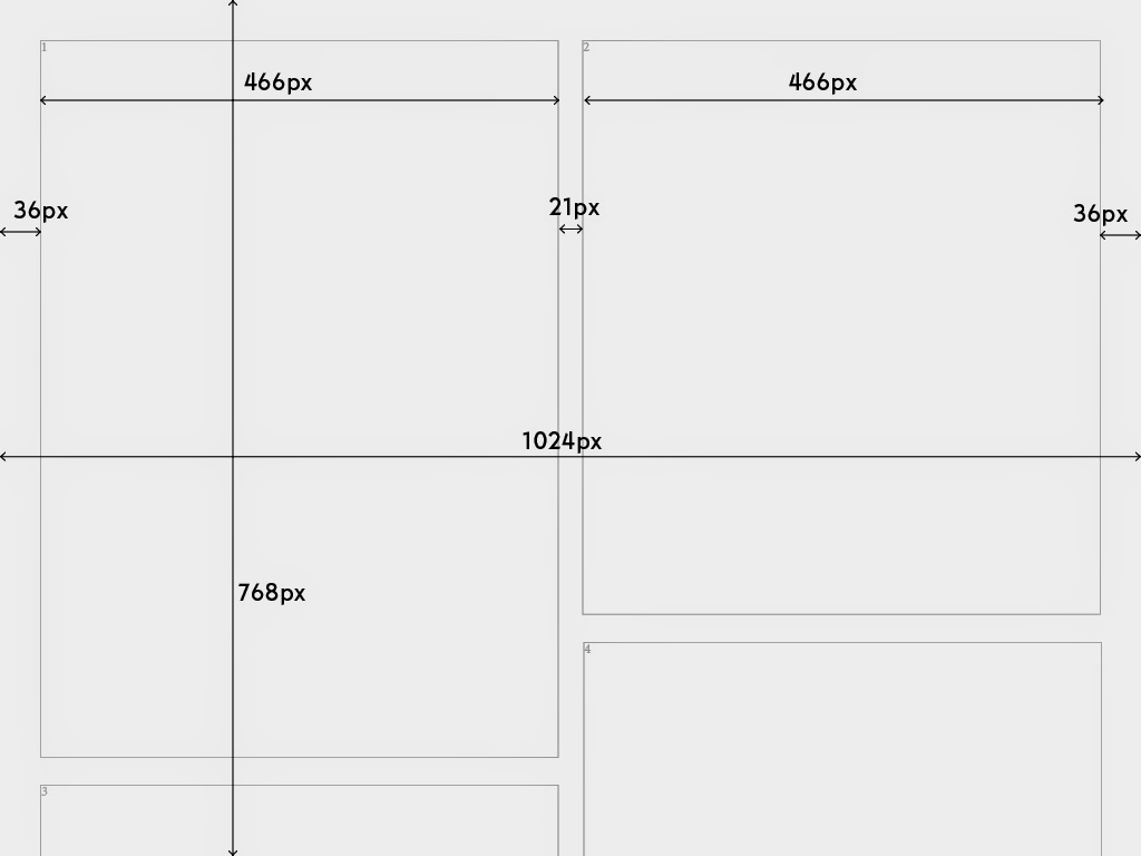
| Single column, this is altered with the zoom tool in the bottom left. |
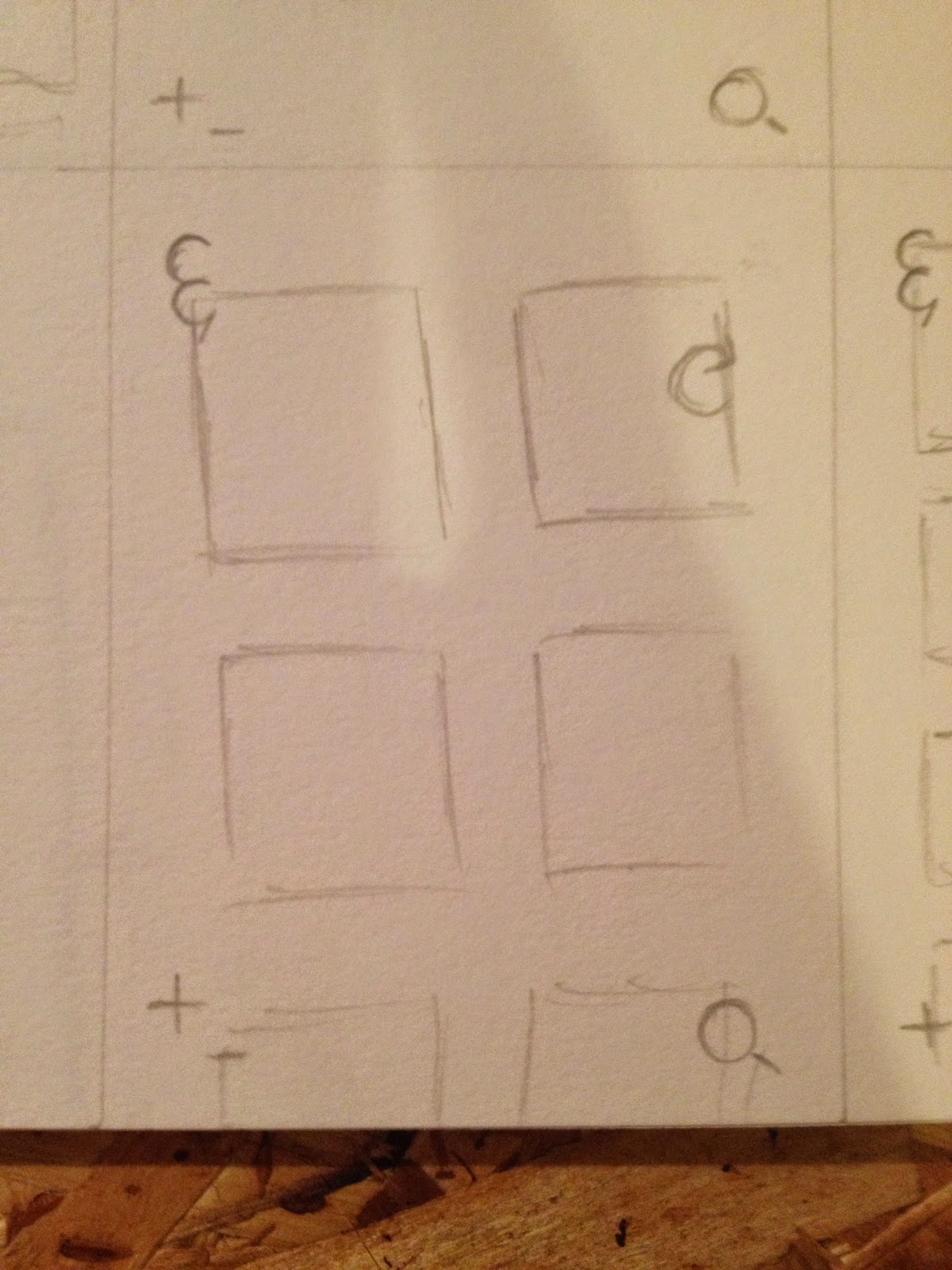 |
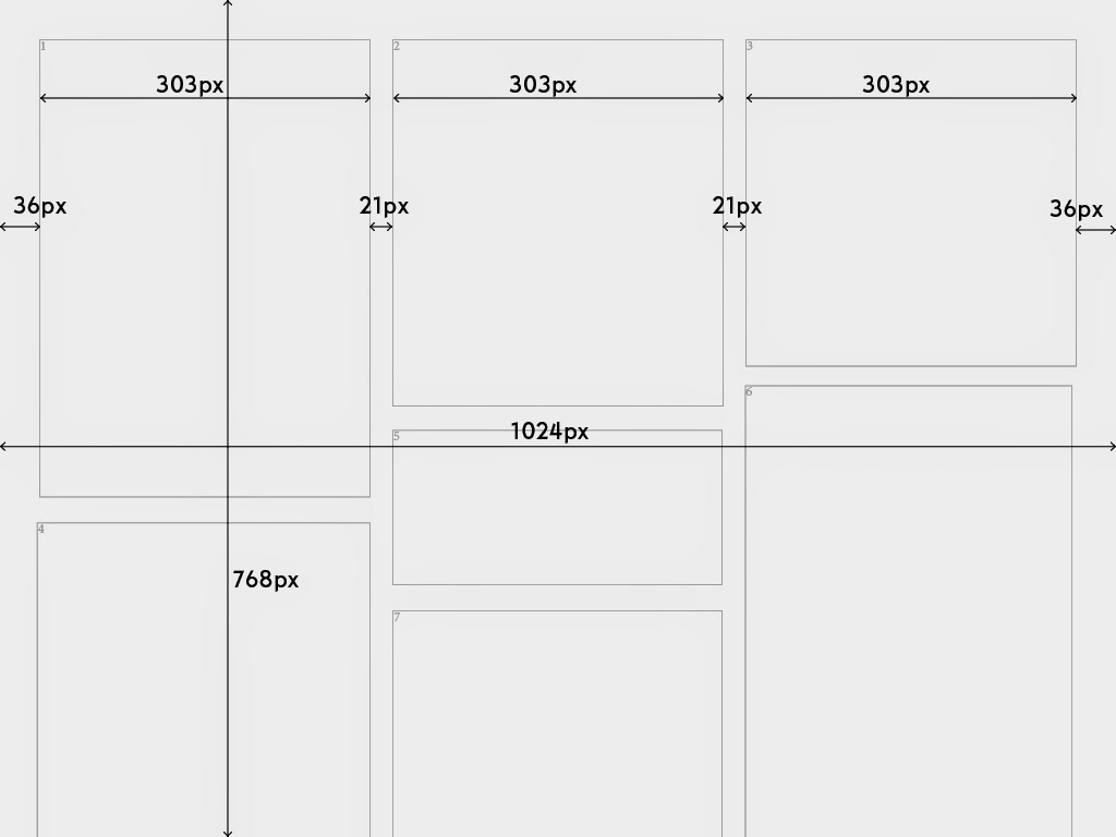
| 2 column grid. |
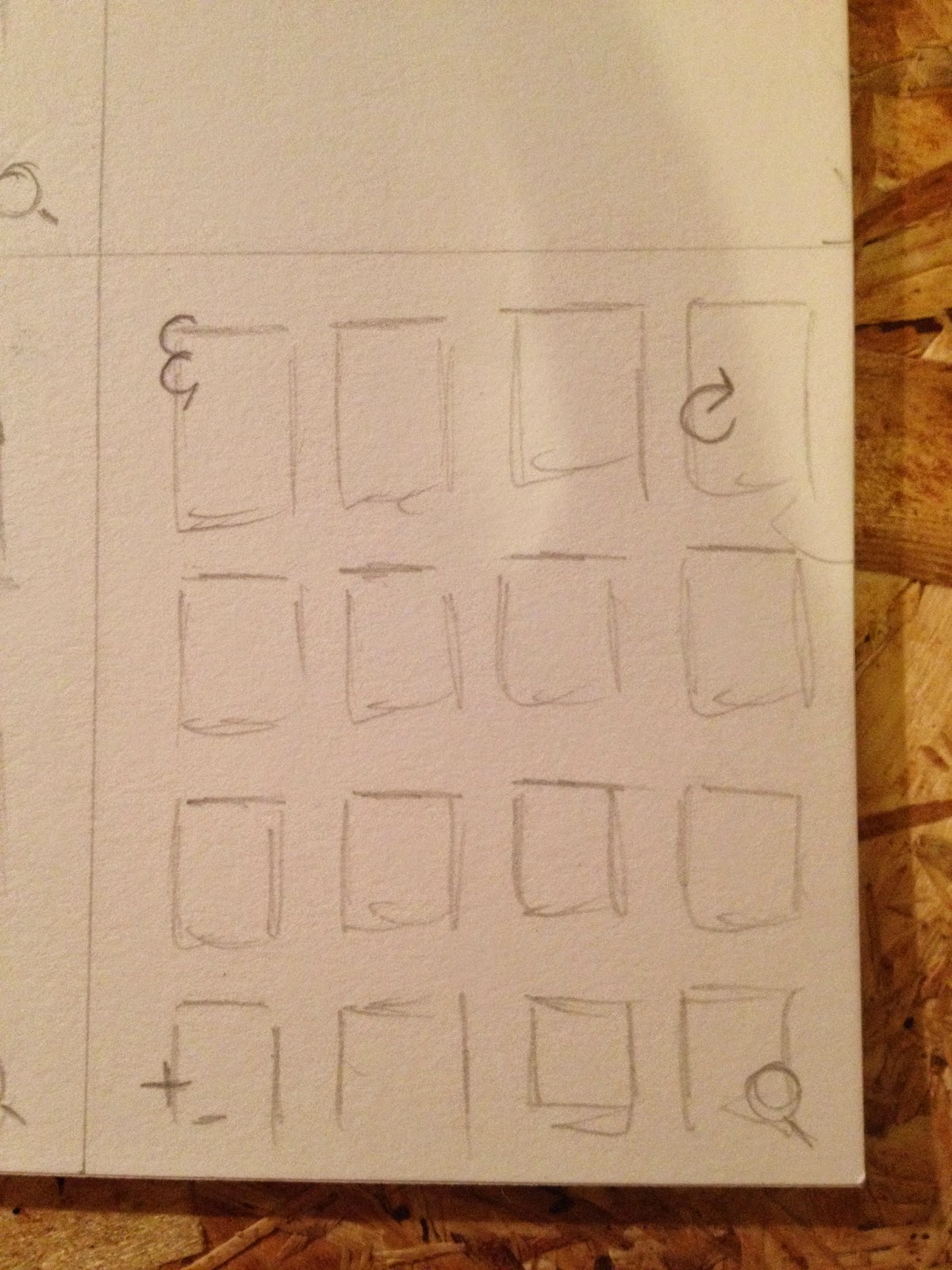 |
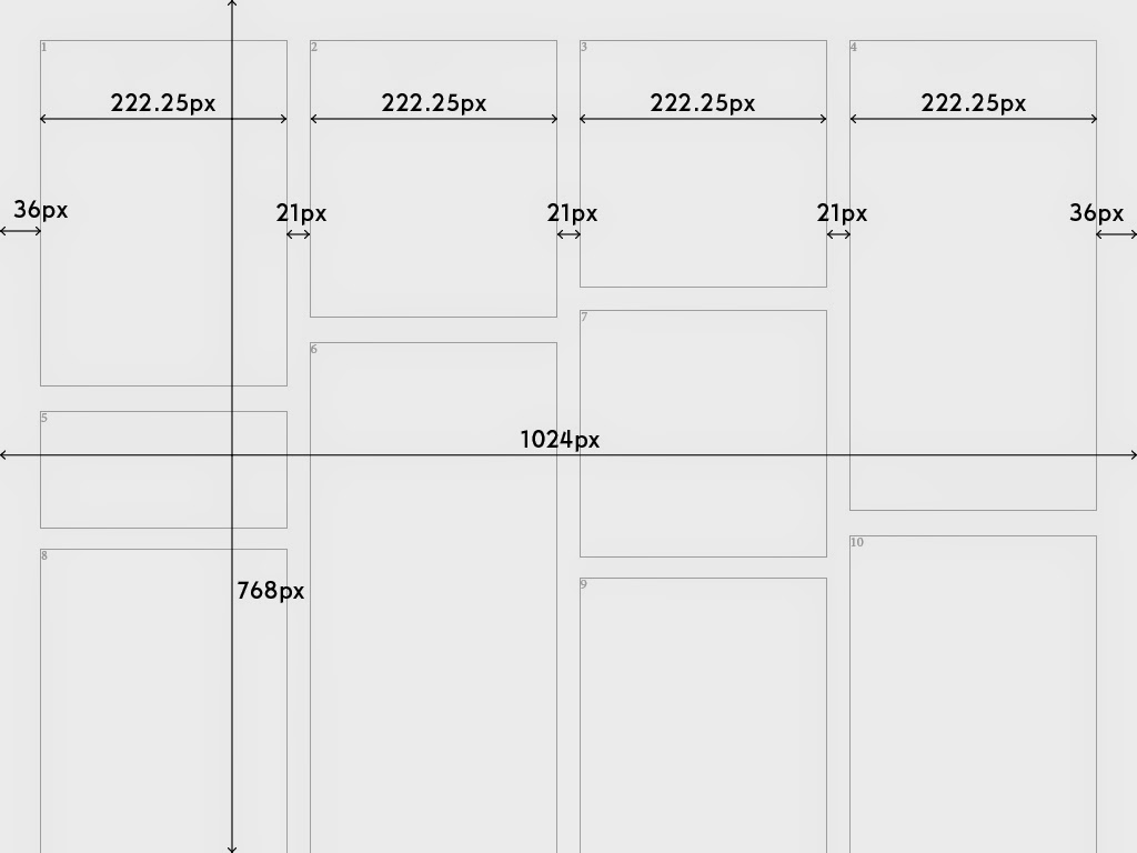
| Max of 4 column grid. |
 |
| 4 |
 |
| 3 |
 |
| 2 |
 |
| 1 |
 |
| 4 |
 |
| 3 |
 |
| 2 |
 |
| 1. A problem arises here... |
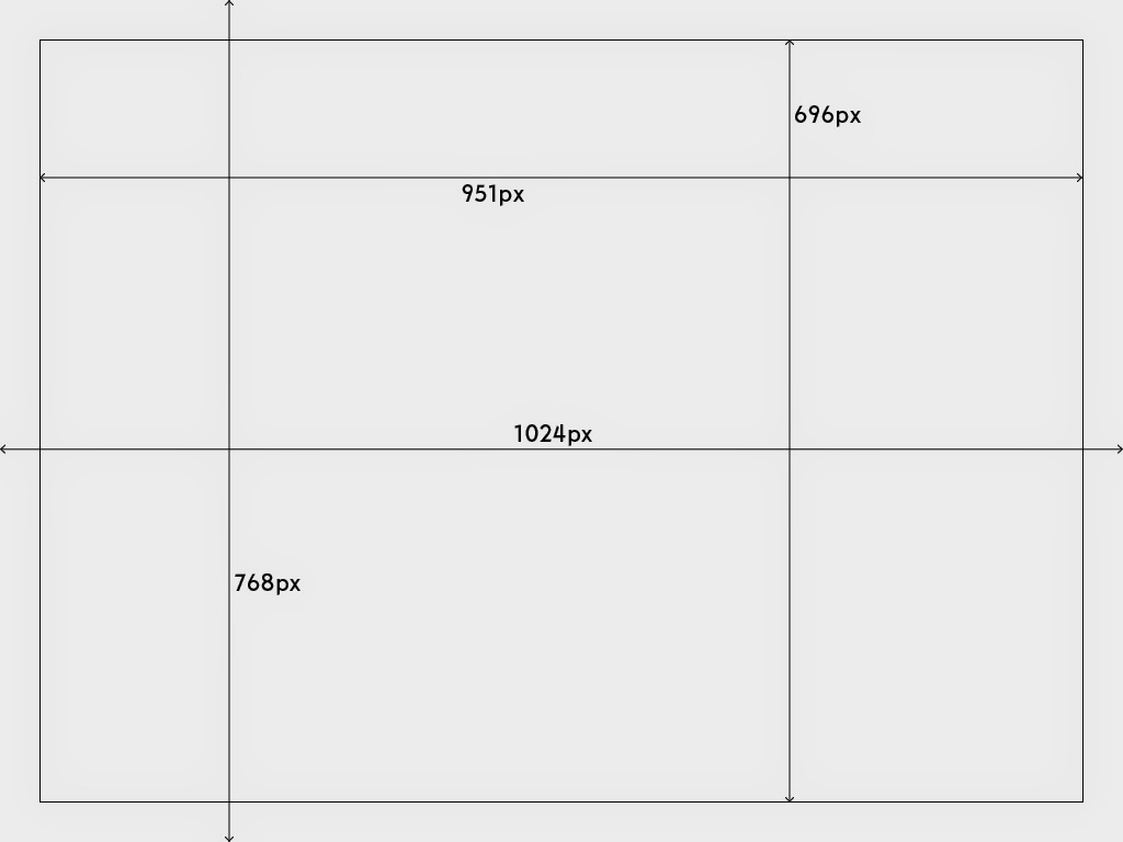 |
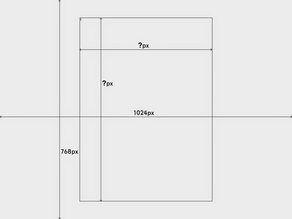
| The bounding box of the image is 951px x 696px when viewed in 1024 x 768px. The image needs to fit in this box so it can be viewed fully in the window, this was a criticism I had of some of the websites in my research. Never fully having the image in a window detracts from the theatre of an image. |
Here are examples of potential image boundaries:
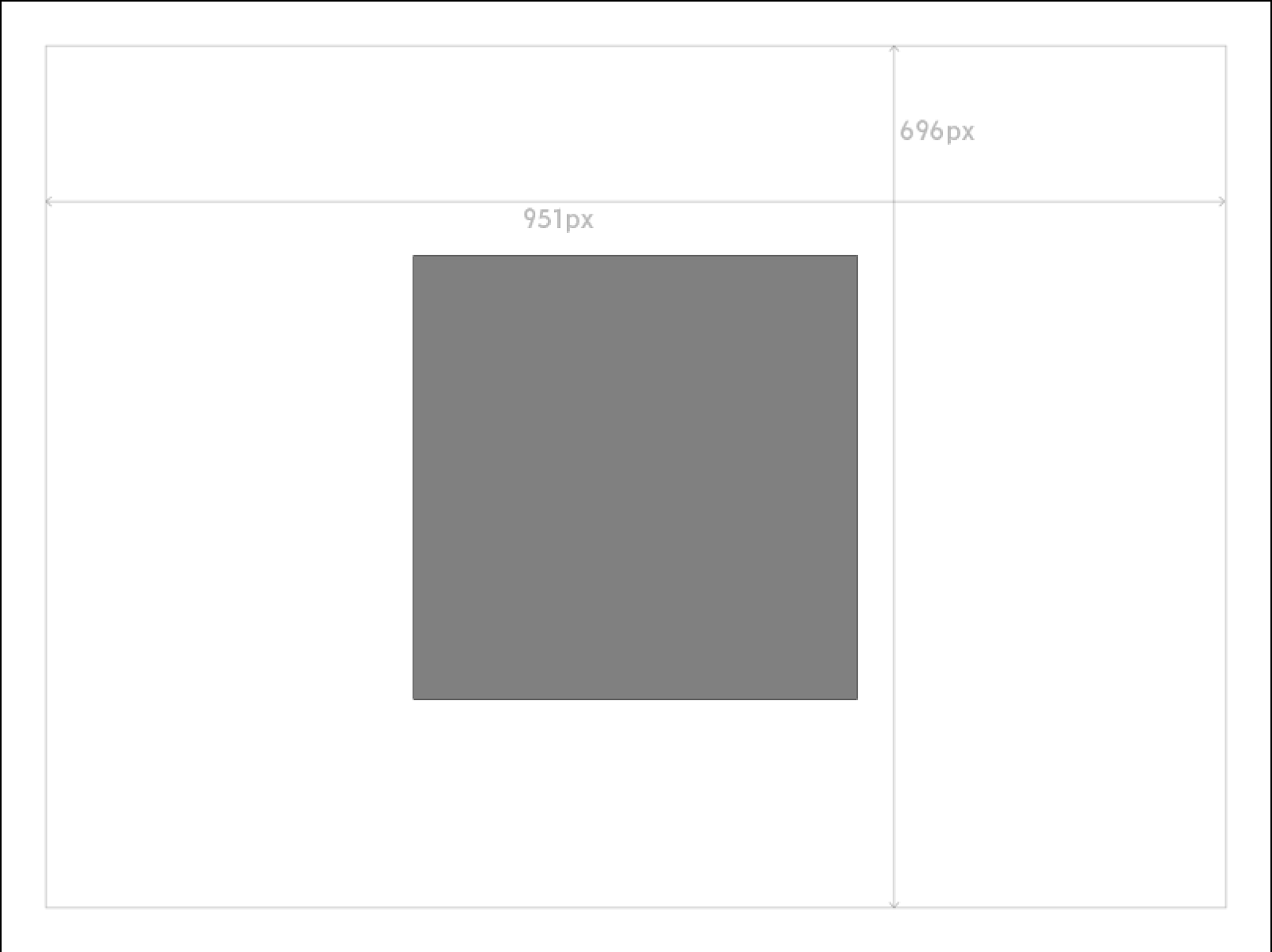 |
| The image will not be enlarged when in 1 column so may result in something similar to this. |
 |
| Full, notice how the image is limited at the bottom even though my website is a downward scroll. |


No comments:
Post a Comment