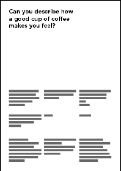
Digital layout experiments from previous brief:
Constructed Grids:
4 column grid
2 x 2 Column Grid:
Layout from Deiter Rams Ethos:
My re arrangement of The City Talking:
A grid to create grids in scale:
Initial Ideas:
 |
| My favourite is the top Grid thumbnail. I developed this. |
 |
| This is one of main influences, Vignelli's 3 X 3 Grid. |
 |
| I have created a 4 x 4 Grid as the balance of type and image is around 50:50 on the left pages. Using margins of 12.7mm and gutters of 4.3mm. |
 |
| After overlaying another sheet of tracing paper with objects, I decided to digitise this. |
 |
| This is the grid I used. |
I decided to use Helvetica Bold, Italic and regular.
24 pt Bold for Headings and 10 pt Bold Sub headings
10 pt Italic for Quotes
10 pt Regular for body copy
No hyphenation.
The Hierarchy dictates that the top left heading will be viewed first.
Followed by any sub headings on adjacent page,
Images,
and Body Copy.


No comments:
Post a Comment