Studio Brief 2 - What is a book? - Grid Layouts
Identifying grids:
![](https://blogger.googleusercontent.com/img/b/R29vZ2xl/AVvXsEjRptfco61B1t8s4kPTXA1oGvub1Qx_jP9Vi4x2gYLDG4NywVeeA76Q3VzzZAFev4hRqJTVLEbj3ExYp3d6CSeMJnakxv8L6wJ8ZYO3rE2mVaNsCxH-nZ_uT_OvR9OkfWhMq5cF-S4CWnCT/s1600/Screen+Shot+2014-04-21+at+19.01.35.png) |
http://www.thegridsystem.org/ - an examples of a modular grid. |
Shortlist 4 column grid:
VICE 2 column grid:
100 Ideas that changed Graphic Design book 3 column grid:
![](https://blogger.googleusercontent.com/img/b/R29vZ2xl/AVvXsEgkfBGnlYuM_4YlbnQxE8EmaRQm6ka_UvM7xe8pKPgmi2jMW2yNeQD-m7g39xweFr6-bWYrconpAwjhBPDwZyEIYfnZSNbq3Njcza_OLsU-oDgCpmHfPBL8AwMiBUN8c2so7WD6Vm4LXVK_/s1600/IMG_0941.jpg) |
I was confused about the irregularity of this layout, the spacing is unequal creating the 3 column of main body copy, the two columns of smaller copy under the image was the first time I have seen an example of this. |
The Watchmen Graphic Novel:
![](https://blogger.googleusercontent.com/img/b/R29vZ2xl/AVvXsEgfb5T5RxSKiJEVHUbN1NI381i8lzNATIUQ637KH_TaU1Ab_P9lcQSbGs0G0SOkXxkkWEDS03GSFtLmJ2i0rkFbJeWPlDZ8o3daOG8anlySbPGhXrumNckbal6-tWzFwhPsj5Uf7WAcKou6/s1600/IMG_0945.jpg) |
I thought a graphic novel was an interesting example as type is written over illustrations. |
Less and More - The Design Ethos Of Dieter Rams
![](https://blogger.googleusercontent.com/img/b/R29vZ2xl/AVvXsEhTpJXaLDyS9SwXhsKZgQEPNDA-ZOwTxWxmmcoF1YeZ_cf_oSME2CWSf6sKn-ESp2FDQ7_nSgO1geLK77AJRS-33wO52k5kmJzCKmhkDROM11cesgP6zM8IjAN4xiemxVZIucCDa63xMd5Q/s1600/IMG_0949.jpg) |
A wide column is complemented by a smaller column that references content from the larger.
An interesting use of hierarchy. |
![](https://blogger.googleusercontent.com/img/b/R29vZ2xl/AVvXsEhenHpCynnB7SXSls4youWj-FD1szF5IuOLMh9jzo1kdO4N8lj8cgzUcsxdGvsLD79OMEBqH1KiFKRTHfy0hCD7cM6m94xVJXw9Gu8UlRIYVETccdDL27_vhtX8PouCrQJuTaL06ryhADJl/s1600/IMG_0107.JPG) |
The use of a grid is perfectly visible. |
![](https://blogger.googleusercontent.com/img/b/R29vZ2xl/AVvXsEh4rob51GzL4OGb7oTX00vkjH_C-bkeWaOG_EI9rjgi3MdsoaEucR0VGYL0snw4zcClHS8GhWYyMk_VS6WrzC7lFHTrNwsBYX68fVKgFvT6WItJT0jVcKBzz6QpzFv7Svt7UbWK5zFD8Mxy/s1600/IMG_0171.jpg) |
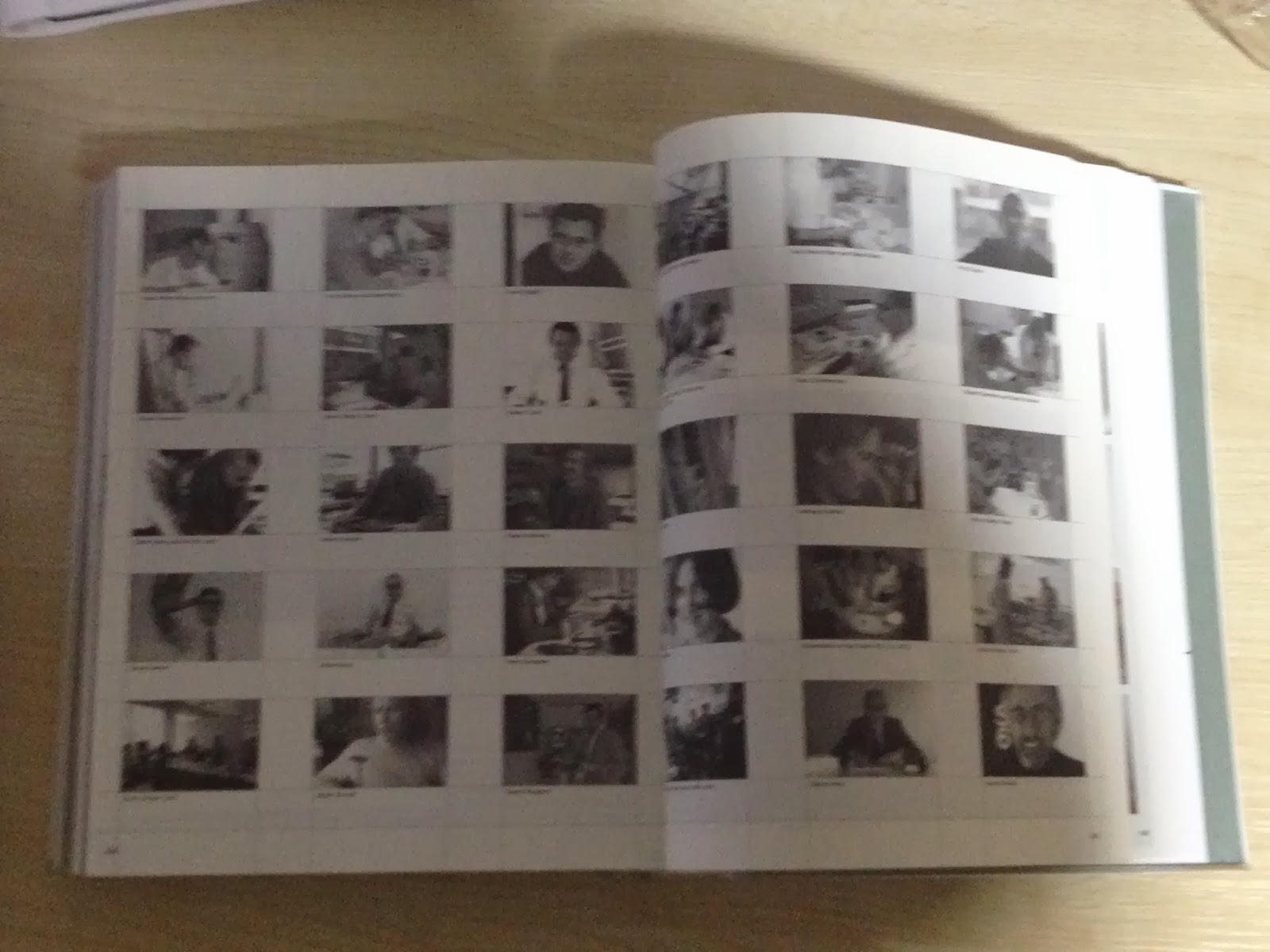
The grid used throughout Printed Pages is also a delight to read, the three columns create a width of body copy that is well designed and legible without straining the horizontal travel. |
![](https://blogger.googleusercontent.com/img/b/R29vZ2xl/AVvXsEgIm58mR16lF1dVjWdOmtIlDf8r8jhNGSPLhKTjNVSJDZ-5SBHQLiExUHqN3lFXKhpeS0Gh1GfgWFB3ibozHbFxcFblA_tTjz5H29GwnT1FekYpB6LiL-e4nDNArT67uky1VSIjUtgizPqN/s1600/IMG_0175.jpg) |
Serif type is used as copy while sans serif is used for larger copy. |
![](https://blogger.googleusercontent.com/img/b/R29vZ2xl/AVvXsEhw7R-x-TX3QFzE2d27LdlPZ0Rbf6ro7uqI9Vg37-r2P5By4xpEhcJiQEPufYv4WLYR8EwIuJ1taLcwkU8iaHpp67Rah9UyB3BY_UXkaPpzadyZyMcqf9wbWv0kQ0mJ1TMAhyphenhyphenrn-34huxf3/s1600/IMG_0176.jpg) |
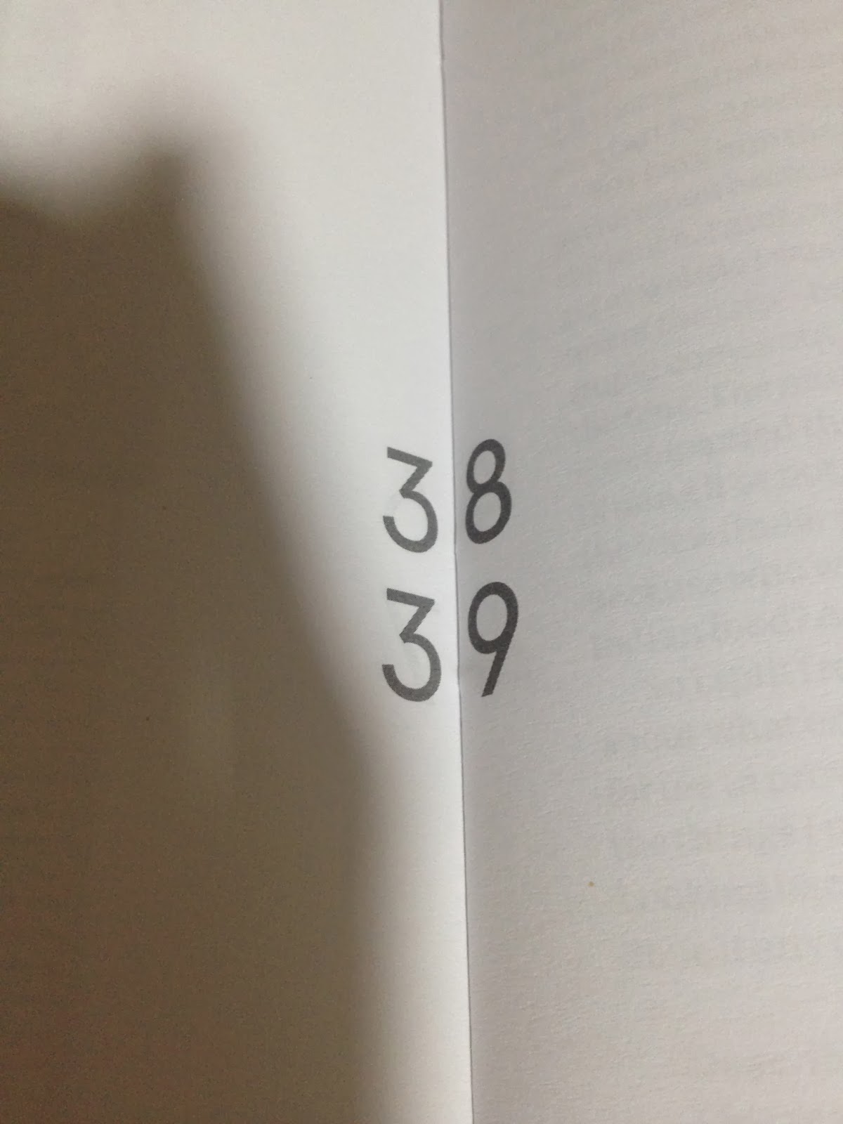
The page number being centred over the fold creates nice continuity between pages. |
![](https://blogger.googleusercontent.com/img/b/R29vZ2xl/AVvXsEiu7bRddv_KzVEdnTqlEtwmiswNQvhyoqjrM3fzznv55CsEia-5eg6PyWsw_7WYiamq4tSCVkgXVbF8Zfm32O2FtCNXU5x89105tjo-0rPCLsOM-cnJdgjkdqhJrj7fAigXtjP5ubXOpT5F/s1600/IMG_0177.jpg) |
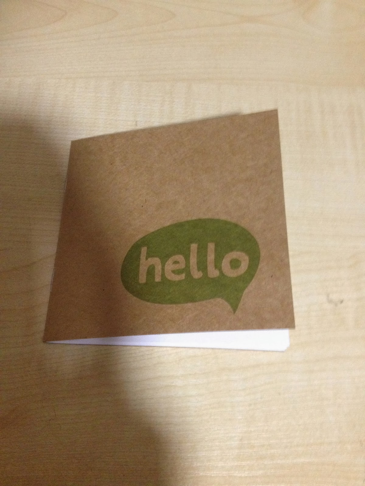
This GRAZE leaflet is also well designed; |
![](https://blogger.googleusercontent.com/img/b/R29vZ2xl/AVvXsEgVzOyQ54h7RjEKfziiyI4dqBrFEeRdHgRrow4TqHNQqHBDzKobQiiTNepxX3MpjFejxei0lbMAgRZUKGTwBHbeNNO9gX47EizLSuK7AmQgxDwQDZhsU0Rz_YdXoI02ZfR-WIDSq0bcruvi/s1600/IMG_0178.jpg) |
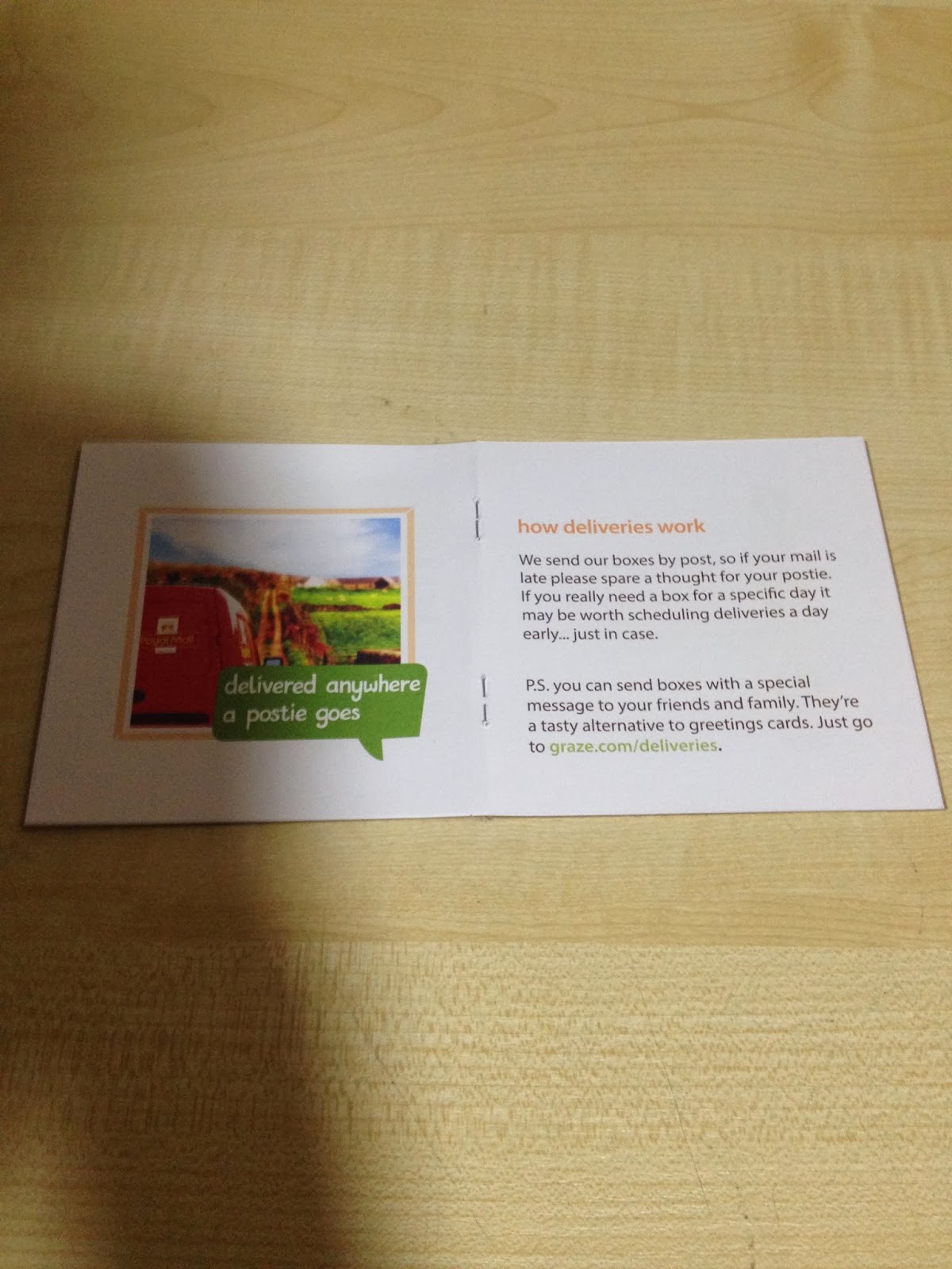
A DPS of image and copy runs throughout the booklet, |
![](https://blogger.googleusercontent.com/img/b/R29vZ2xl/AVvXsEgPU5tz3fr7O_aakh_-_bEwzRGG_Z6TERVgS0R4GIiB70p-A6xnMsx2frBle3k8FU8tC6s3p4CUX1j90L2WfsNIBPQYpY244oFGZ3pbTQcZ4HS7DoWVYuuH9Wvl4yOcPKose72ArpCyS0GP/s1600/IMG_0179.jpg) |
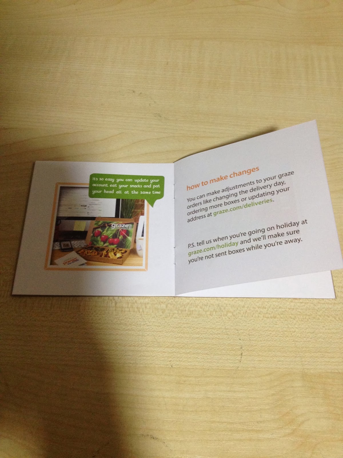
While only two short copy is displayed a page. |
![](https://blogger.googleusercontent.com/img/b/R29vZ2xl/AVvXsEj_yVUMiO8iR2iTeXJk01c9Z000jckHou2Kb5Fj9ACugkEjWFNBure7WxlFarZnTYcQjpOBfJDQ1LI3E7qBnXofxk2TwhwC5IXwtZbXshSpL9OwCMwvDCH3jL6jNUlsH5spbWpDC3csq7ZS/s1600/Screen+Shot+2014-01-08+at+13.40.16.png) |
Looking at both the context and design here, Vignelli's Canon uses a two column page, similarly to Printed pages, the width of the copy is kept balanced. |
![](https://blogger.googleusercontent.com/img/b/R29vZ2xl/AVvXsEh07HEU6YP-AvDKvbsAWdqf9TCwyQo5x3tyIwCJLk5EeXHlAPu9PQUf9b0TV8IG2WZUsWgsR-mIz64NLz6qddGPAeohanYHoiwsK0YPzhloWjIUxa2UcHC1n9_ElF-HOk29hwwHNaqSZYjs/s1600/Screen+Shot+2014-01-08+at+13.47.17.png) |
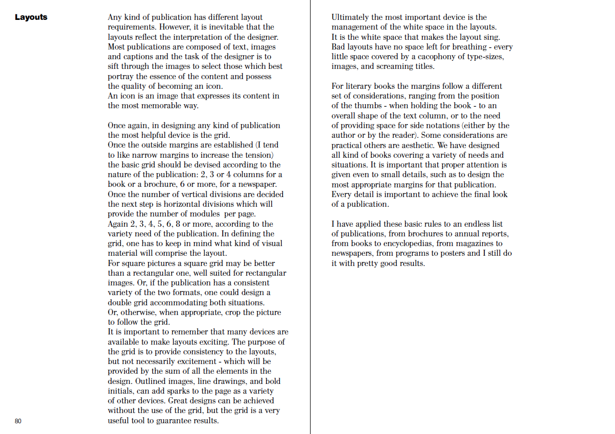
'The task of the designer is to sift through the images to select those which best portray the essence of the content and possess the quality of becoming an icon' |
![](https://blogger.googleusercontent.com/img/b/R29vZ2xl/AVvXsEi7otpAcA342MMhzfqUQ1RTD3JDJttMAN6TA4FgFkpK1O-_NERsuaAO9Cz4DsorjTGhIWBlrK1rnY6yc-AhPAYCn5v5oSH_ZYzL8sveB3czIIIIH70_2wNoB6BbiL9lqupbmr_wKY7aDAhH/s1600/Screen+Shot+2014-01-08+at+13.49.47.png) |
Examples from The Vignelli Canon. |
![](https://blogger.googleusercontent.com/img/b/R29vZ2xl/AVvXsEisPApLSP_Wru4TRj1VQkdaJyAW_05r9tc6mnHhFak3Cj3N6jj5xTCJAwOh5NfF5IDKTcsCuWFrbOhmZjsr0NdMEjvg1uEl6i-5FR0s7l4mK0rEjD45fNu6QC1gca1uy-WQnEpnwmbrfkwD/s1600/Screen+Shot+2014-01-08+at+13.53.23.png) |
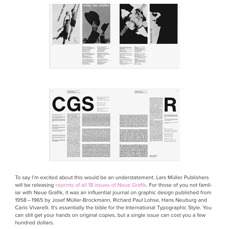
An extract from AISLE ONE, the layout used throughout Neue Grafik shows the use of a well balanced grid, I believe the more a grid is evident within layout, the more readable. |
![](https://blogger.googleusercontent.com/img/b/R29vZ2xl/AVvXsEiJ9fnU4QlKjM4sL_22ZF0sNQAAT2l8Mhxs7c2-205rt2Xzq2g2SXTGoLV6ZHgMmWrFv24oRWWCw9Bqv6W6qk2_VRLWfNPl0H6ShXpG1c4KjEbf2zc6xEkFKn0da6pNWwX9NgiqsnNA02Oc/s1600/Screen+Shot+2014-01-08+at+14.36.56.png) |
Another extract from AISLE ONE, the Edition Two layout visible shows the use of a DPS image, this creates continuity and flow of read. |
![](https://blogger.googleusercontent.com/img/b/R29vZ2xl/AVvXsEgXxp7qk4vmaMd5BTIJfQHVg1fP6OajxZ7U7Hybm3vGdWwR3qUQbA9lKhU-Q0RSw3Do8nT4-WHjYfWKQJMP3RGgJs52k8RVxeAWJICNKJHJ5N_v7fKQpCD0ikIOcVsiU97IFmdFOEaq1vHM/s1600/Screen+Shot+2014-01-08+at+14.43.55.png) |
I like the full page two column grid used on the top left image due to the contrast of point size for sub headings. |
![](https://blogger.googleusercontent.com/img/b/R29vZ2xl/AVvXsEgHlXzSvn8Hdpvo-SrKZCLN4fhbxBivJKEVmaag-IB4iC9VbsQUtMlQjyu01_TWYDfb7BmBpq3_8Bn3lLQgBDT7eiUXlCKqbFRwLoIN9T60K4TPE_qC6Adf31_moBCpITY8cRfKvdhdoNww/s1600/Screen+Shot+2014-01-08+at+14.51.06.png)
The City Talking 10 column grid:
I deconstructed the grid and rearranged its content:
I discovered how to create mock up grids to scale:
No comments:
Post a Comment