Notes:
Use Indesign to create 5 page spreads based on the previous research brief.
5 DPS @ A3 ( 2 X B5)
Research page layout
Consider target audience and where they would be read.
NOTICE: This brief and the following brief merge quite significantly, I have had to include brand development here to place the 5 DPS in context.
Before starting my research I thought it best to consider my target audience as this influences the type of publication.
I am going to create a menu using 5 DPS, the menu is going to be part of a brand that I will create to place this menu in context.
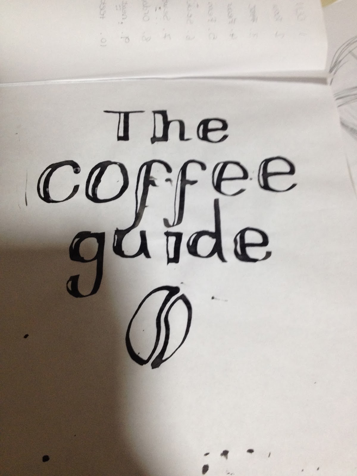
The brand is ' The Coffee Guide' , The Coffee Guide will be a cafe in Leeds City Centre hidden from the main stream of shoppers; similar to Mrs. Atha's:
The concept behind The Coffee Guide is clear, to simply inform customers about a world of coffee. Simplicity and information are key.
My target audience is going to be a range of young professionals who would rather visit an independent coffee shop rather than a international soulless establishment. Not forgetting 'Coffee beginners' of course, these are people who don't necessarily know anything about coffee apart from its existence as a beverage who have come to The Coffee Guide to gain knowledge.
Because of this, the layout is going to have to be clearly understood as well as being basic to the eye to create ease of understanding for the 'Coffee beginners'.
I am going to look at well organised, easily readable layouts.
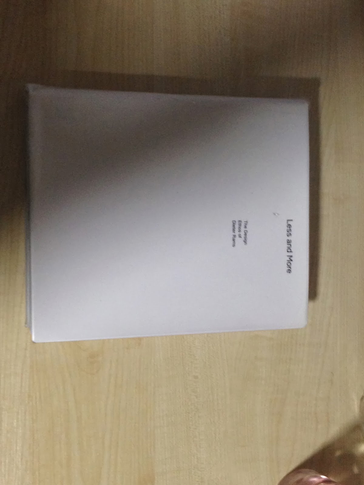 |
| Dieter Rams' Less but more has been a great influence on me recently and I admire the content as well as the layout. The ease of reading is brilliant while being a fresh change from current distorted trend layouts. |
 |
| The use of a grid is perfectly visible. |
 |
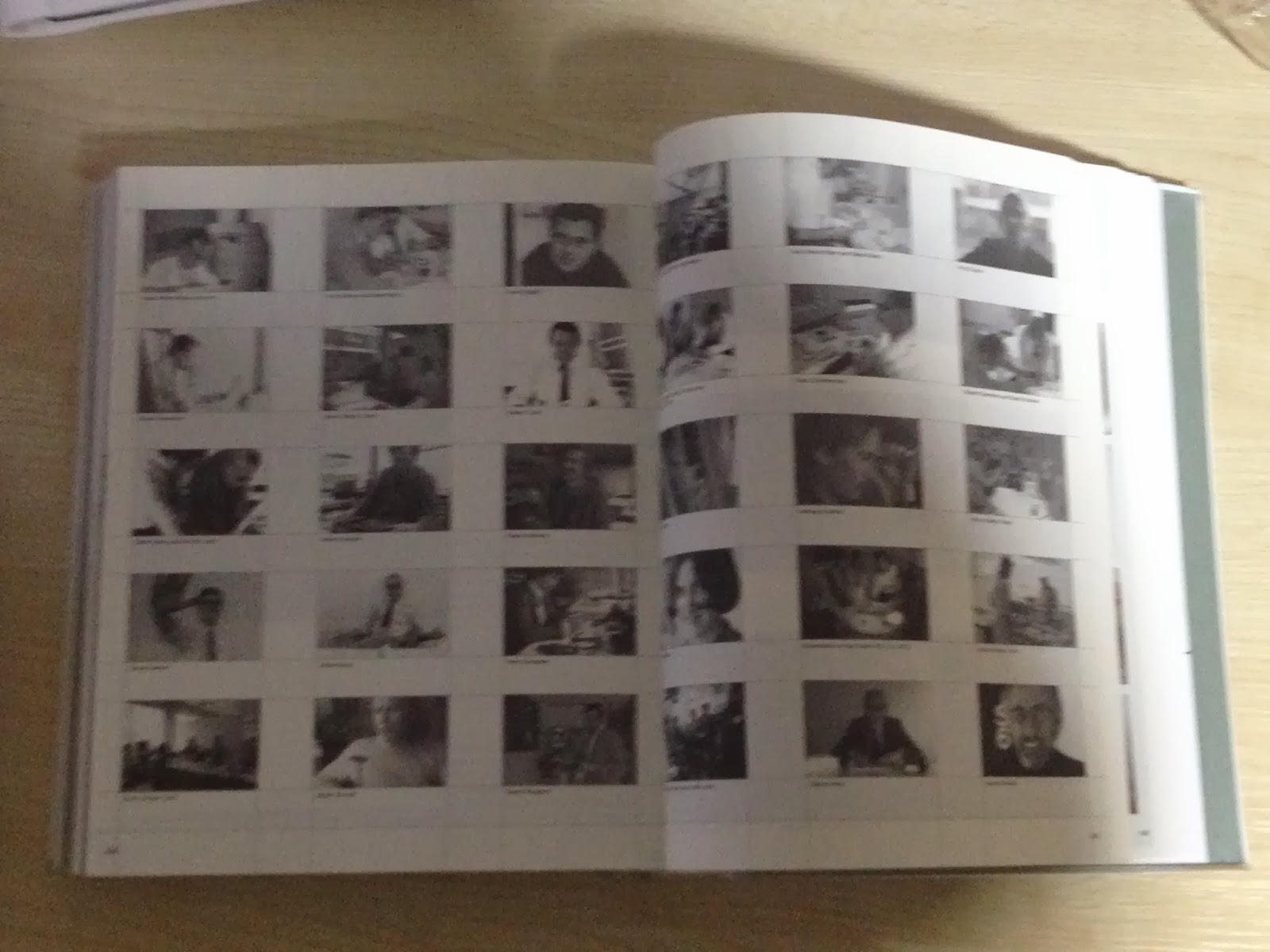
| The grid used throughout Printed Pages is also a delight to read, the three columns create a width of body copy that is well designed and legible without straining the horizontal travel. |
 |
| Serif type is used as copy while sans serif is used for larger copy. |
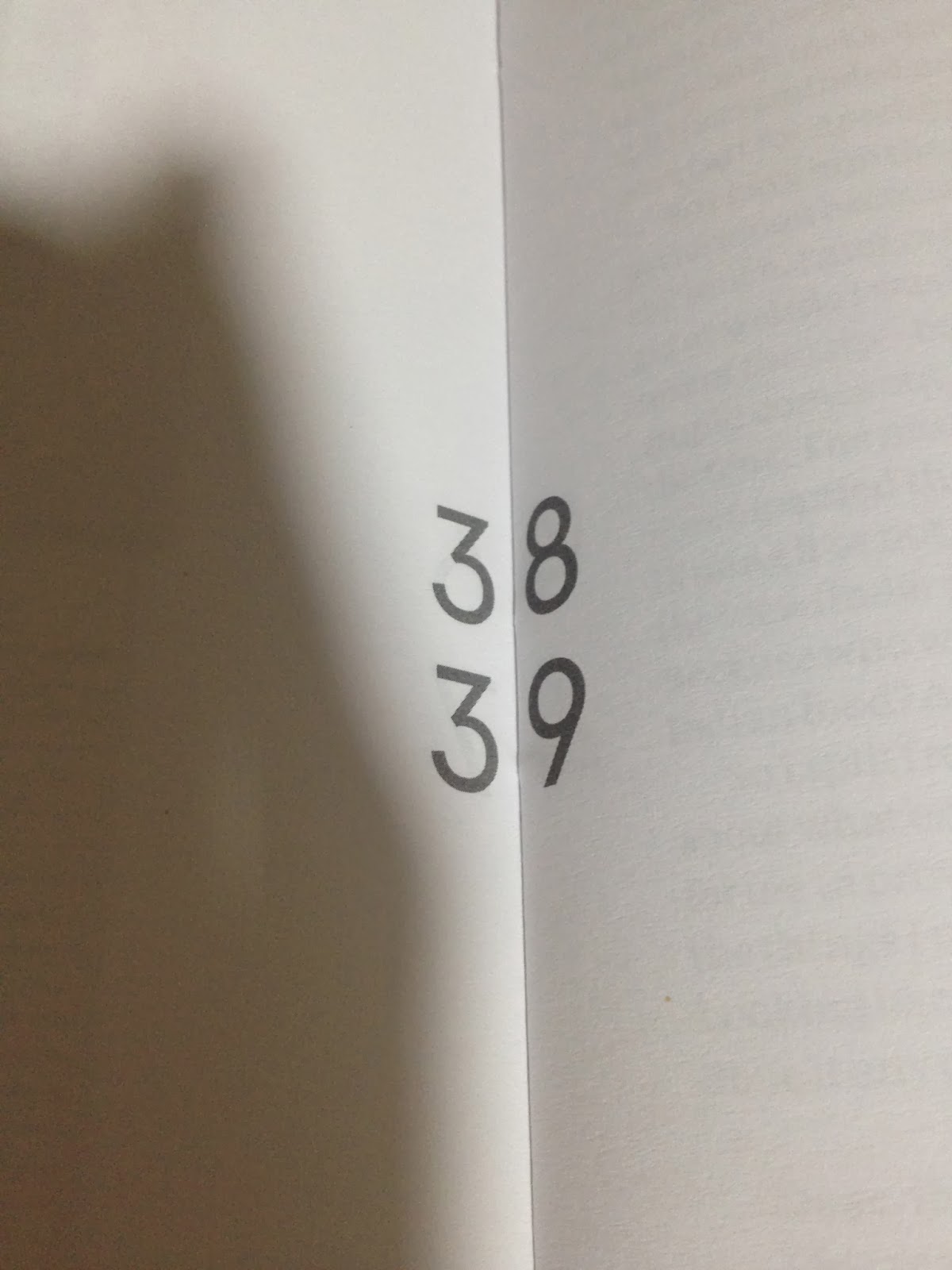 |
| The page number being centred over the fold creates nice continuity between pages. |
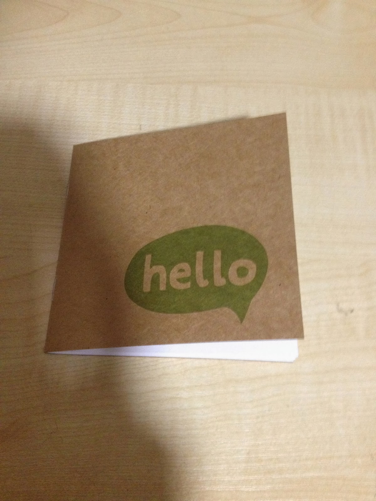 |
| This GRAZE leaflet is also well designed; |
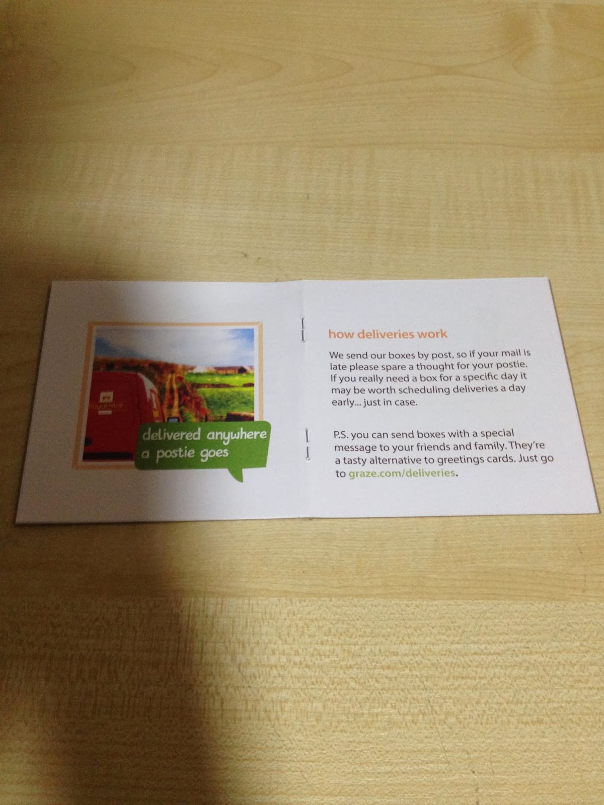 |
| A DPS of image and copy runs throughout the booklet, |
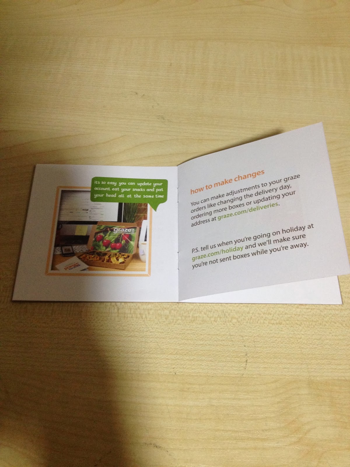 |
| While only two short copy is displayed a page. |
 |
| Looking at both the context and design here, Vignelli's Canon uses a two column page, similarly to Printed pages, the width of the copy is kept balanced. |
 |
| 'The task of the designer is to sift through the images to select those which best portray the essence of the content and possess the quality of becoming an icon' |
 |
| Examples from The Vignelli Canon. |
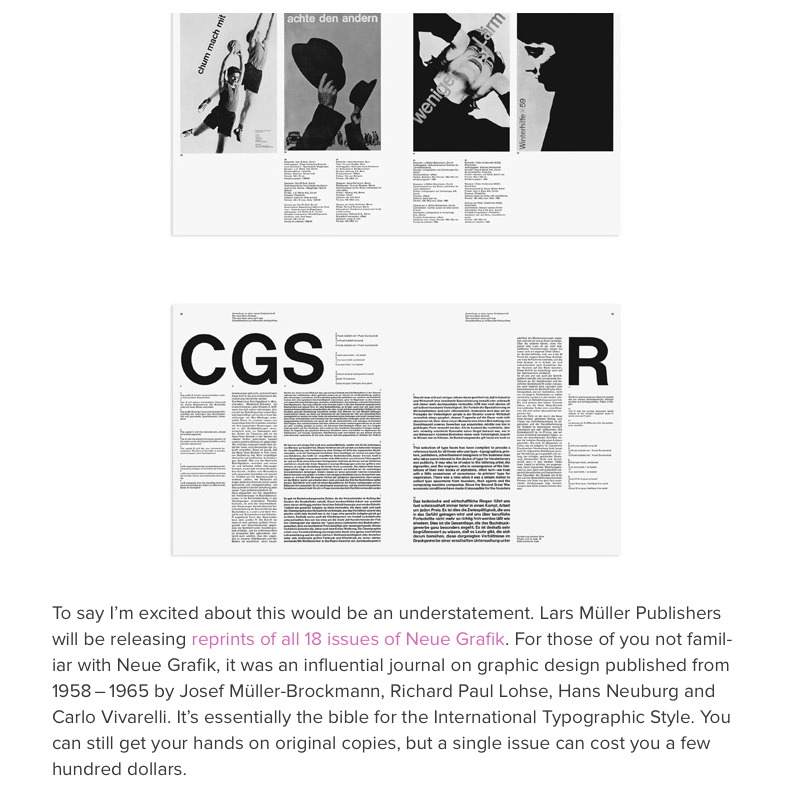 |
| An extract from AISLE ONE, the layout used throughout Neue Grafik shows the use of a well balanced grid, I believe the more a grid is evident within layout, the more readable. |
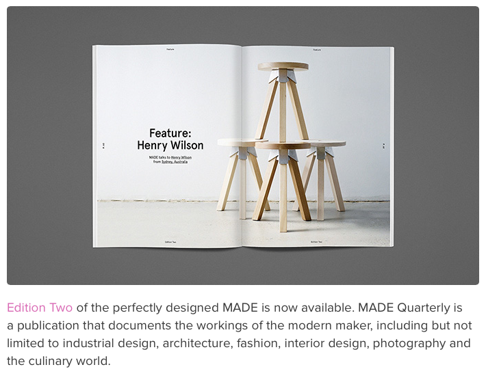 |
| Another extract from AISLE ONE, the Edition Two layout visible shows the use of a DPS image, this creates continuity and flow of read. |
 |
| I like the full page two column grid used on the top left image due to the contrast of point size for sub headings. |
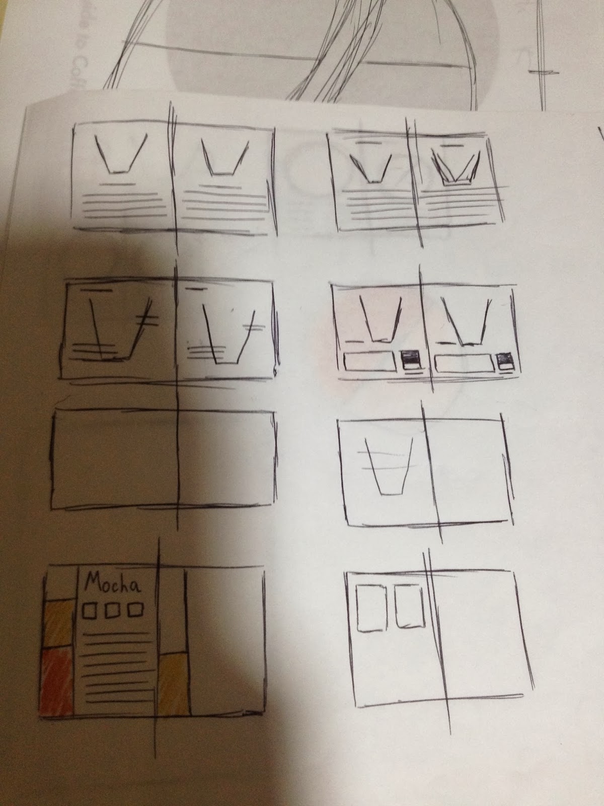
After grasping a understanding of layouts that are used, I thought it best to create my content for the DPS.
I want to clearly display the ingredients of a range of coffee, similar to that of the info graphics I showed in research brief. I had seen lots of 3D vector cups being used previous and I didn't want to simply create a design with a few changes to the existing work.
I began with a circle to not only represent a pie chart but also an aerial view of a cup. I experimented with numerous layouts to find an intriguing balanced DPS. As a starting point, I tried to include one fact, one statistic, the illustration and ingredients on each display.
Resemblance to my favourite poster designs by Antonio Carusone subconsciously became evident:
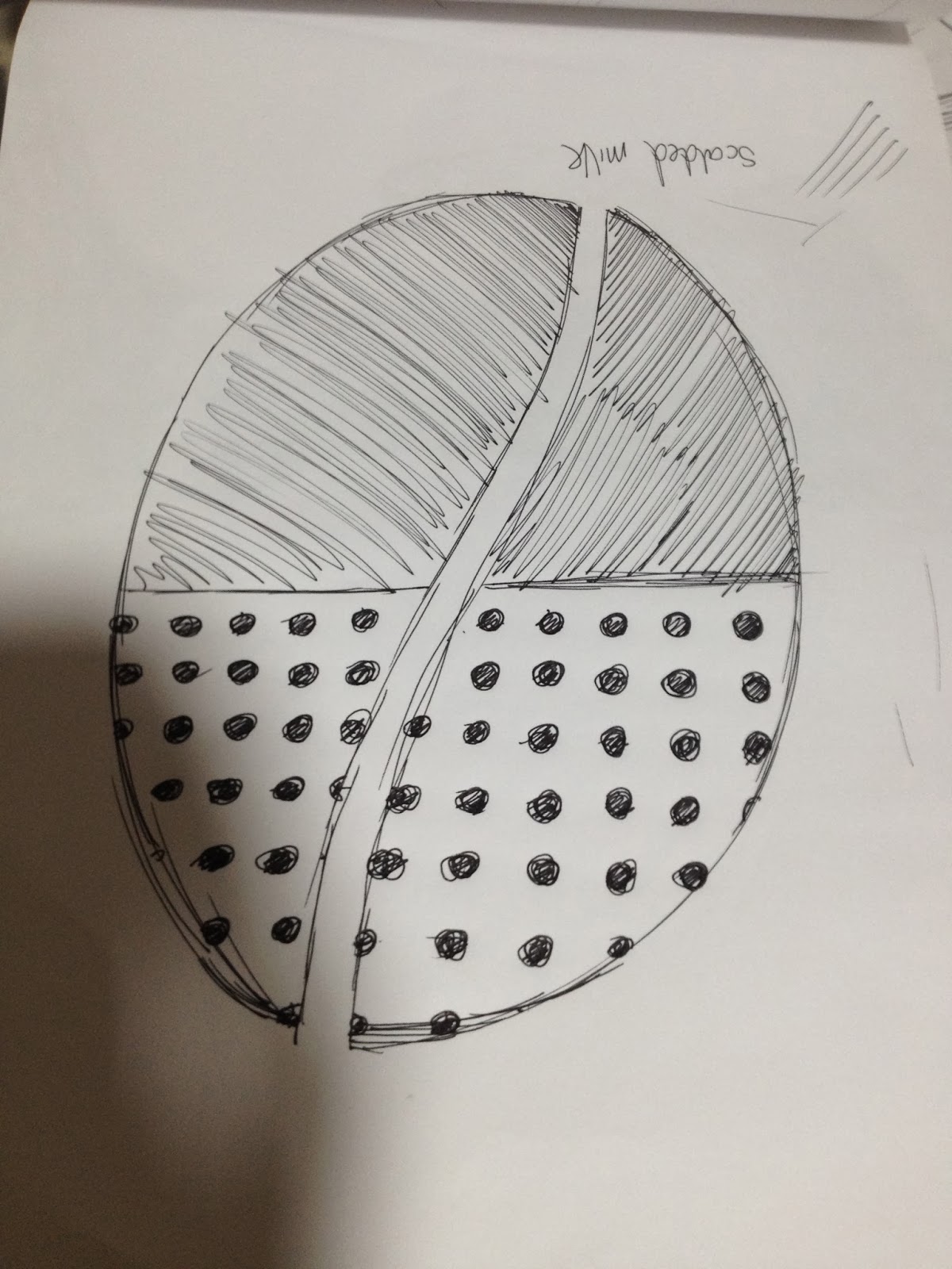
I found myself being carried away with this belief that a circle was the best way to represent this information. The critique brought a lot of negative feedback for the design below:
'Dislike'
'Colours not pleasing or clear without a key'
'Be more subtle'
'Not very clear'
'Need a Hierache'
'Awful colours and too plain'
'Brown is overbearing'
I had to change the design, the key, the colours and the layout however the idea of presenting the ingredients of various coffee was received well:
'Like the concept'
'I like the simplicity'
'Chart and type work well'
'I appreciate the the minimal approach to representing different coffees'
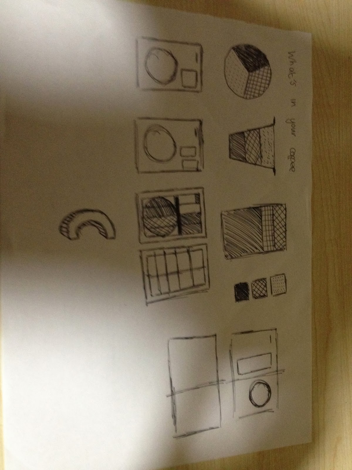
I started again and came up with various charts and graphs I could use, the research I did was all very similar to the several info graphic I had found earlier.
 |
| A range of layout that included a graph (bottom left) has a info graphic going up the right hand side of the page. |
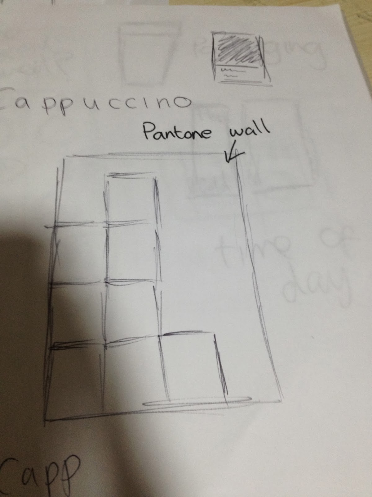 |
| The idea of a pantone wall, a colour would represent the resemblance of a certain coffee's colour, this will have been too busy for the 'Coffee beginners' |
 |
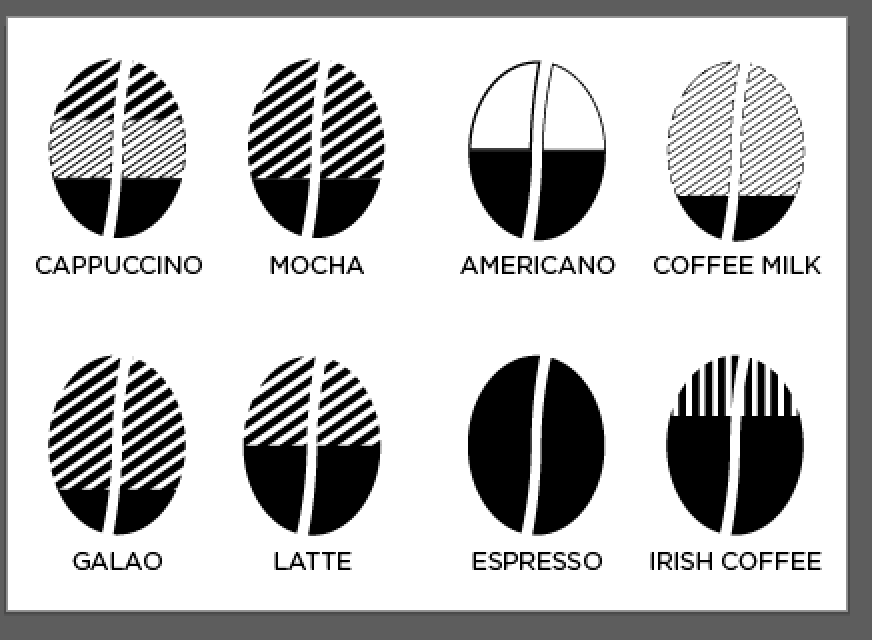
| Using a coffee bean as a chart, using different textures to resemble ingredients. This would stop any negative aspects of colour preference as well as being cheaper to produce or even quicker to screen print! |
 |
| Using indian ink and a wide nib. |
 |
| The bean idea set within a grid. |
 |
| Use of pen stroke to identify difference. |
 |
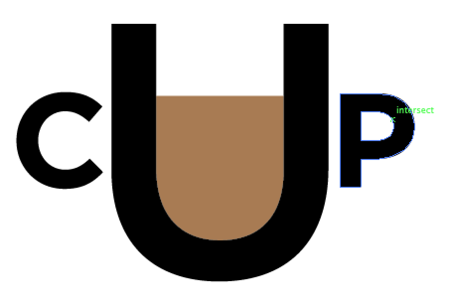
| Using a C and U, I thought this to resemble a cup, I rather enjoyed this subtle idea however the name cup did not do my concept justice. I will be saving this idea for future use. I did develop the idea however. |
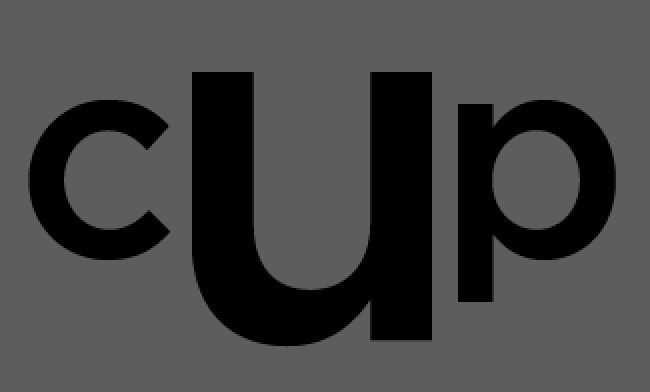 |
| Will not work in lowercase. |
 |
| I was very happy with this, unfortunately I could not use it here. |
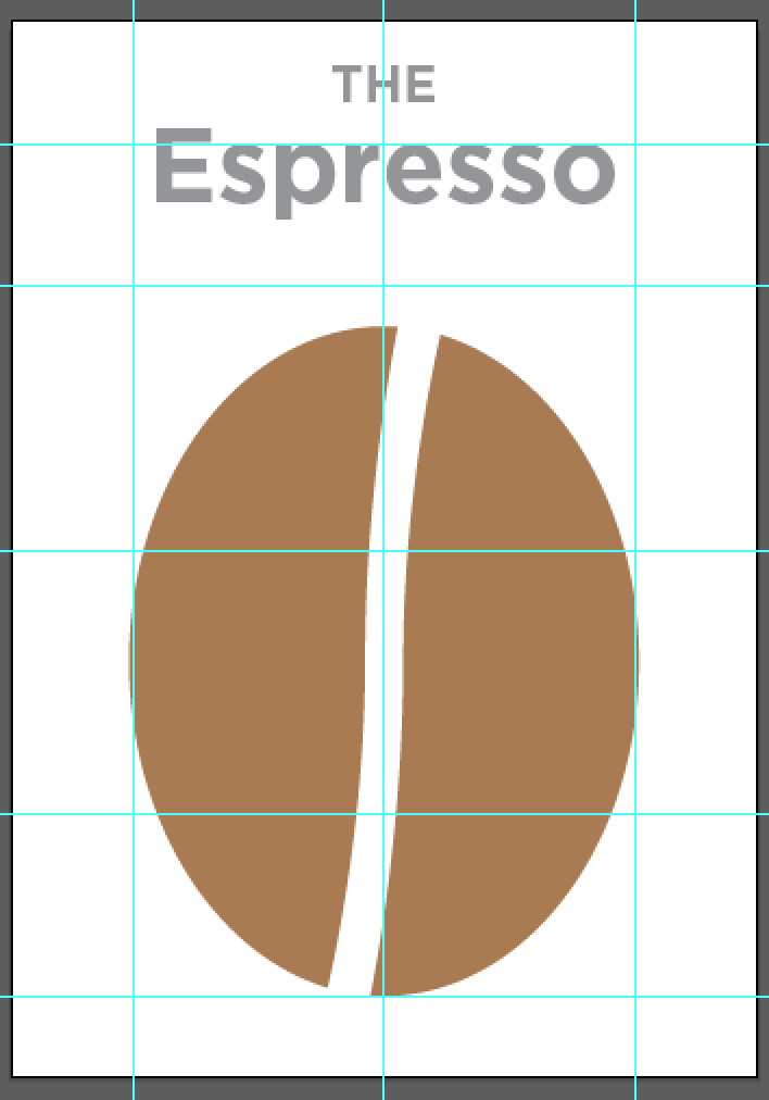 |
| After creating a bean vector and placing it against a grid, it resembled the usual suspects DVD cover which I thought was rather strange. Because of this relation, I added 'the' before 'expresso' to communicate a sense of theatre to a simple bean. |
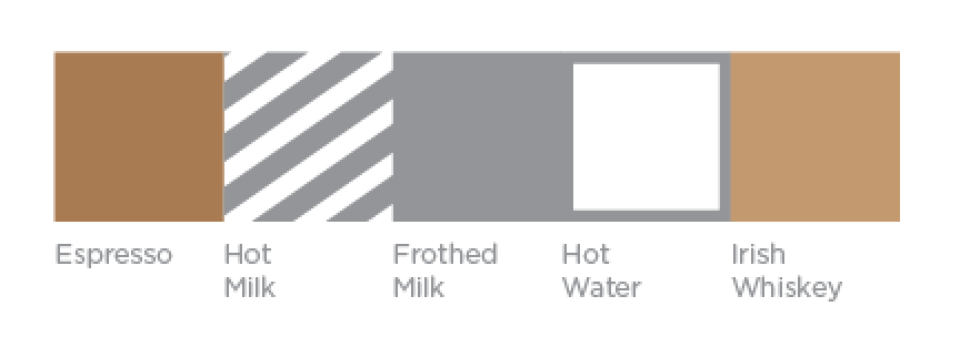 |
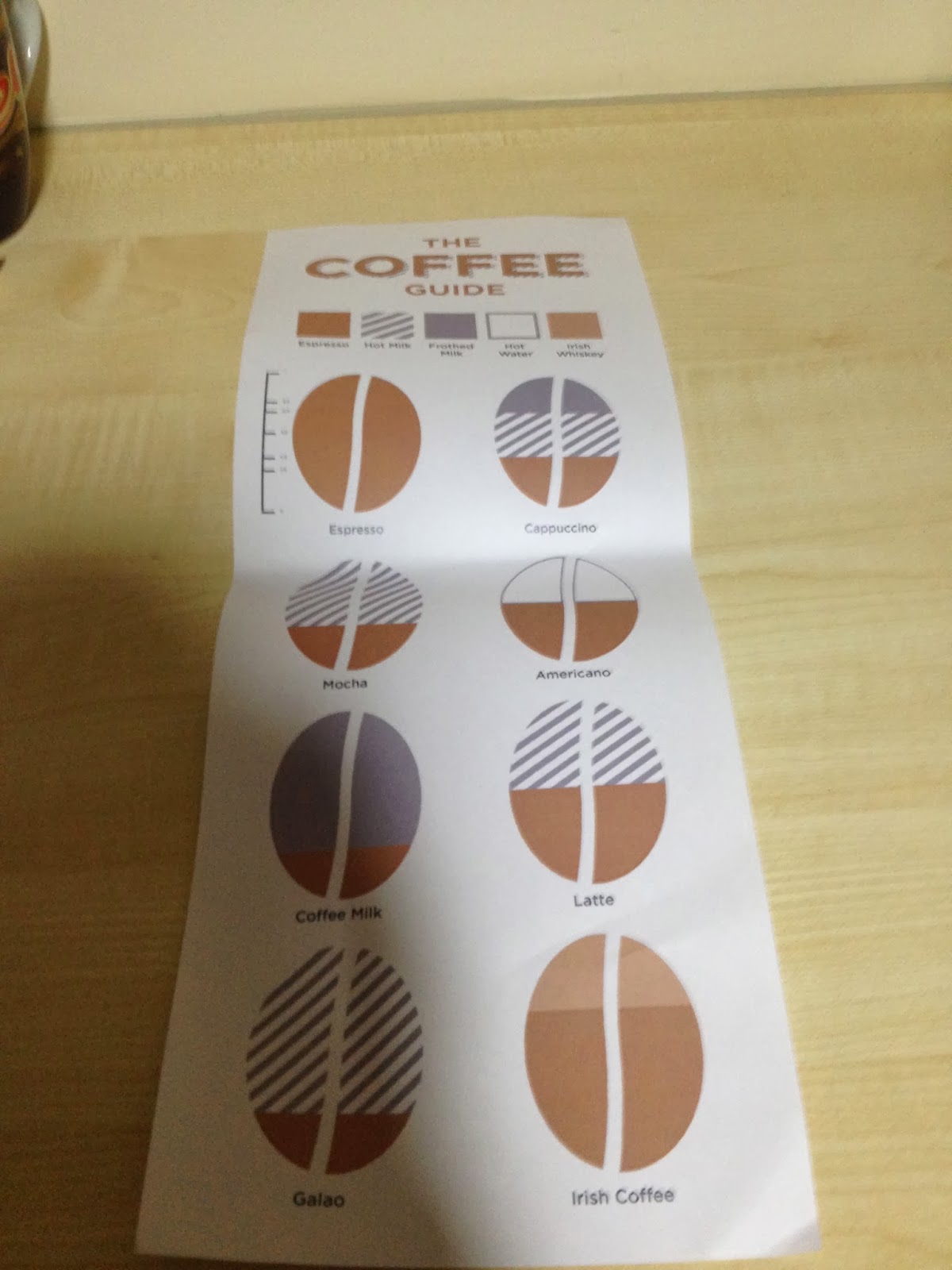
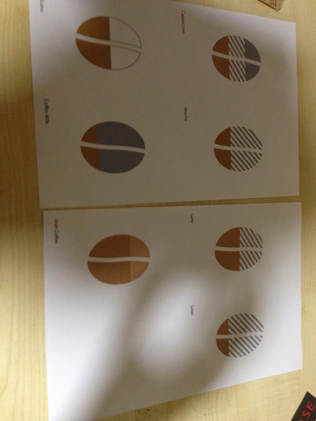
| I created a much clearer key |
 |
| The bean was a much more recognisable shape and does appear more elegant and sophisticated than a circle. |
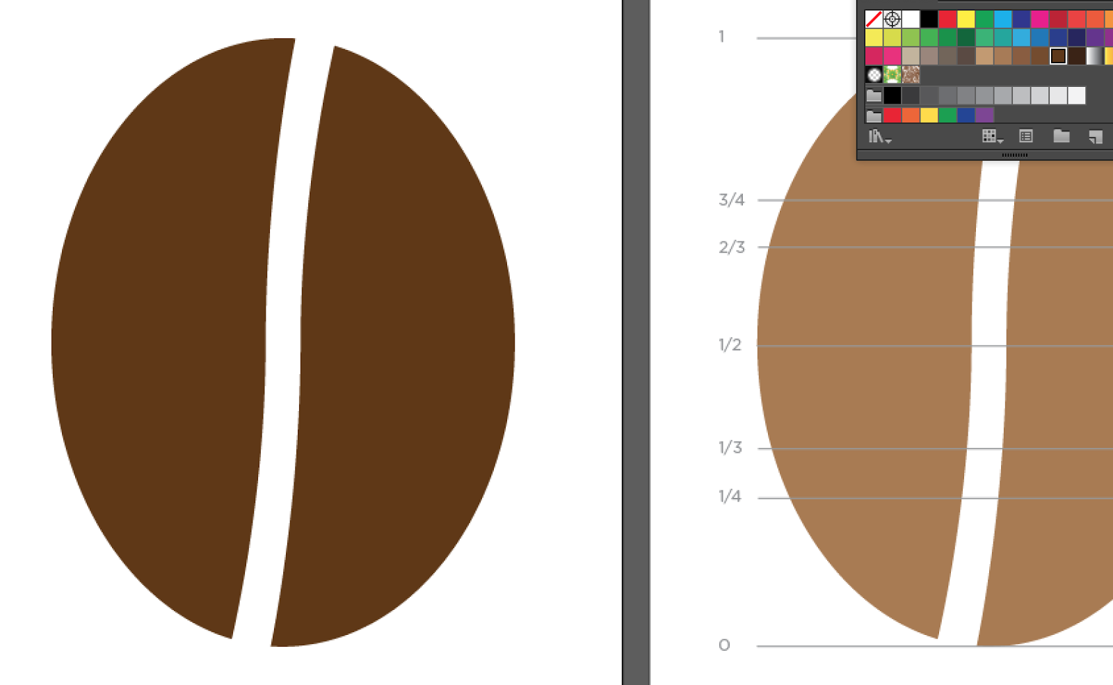 |
| I experimented with colour to find a more visually pleasing brown as the previous choice was 'awful' |
 |
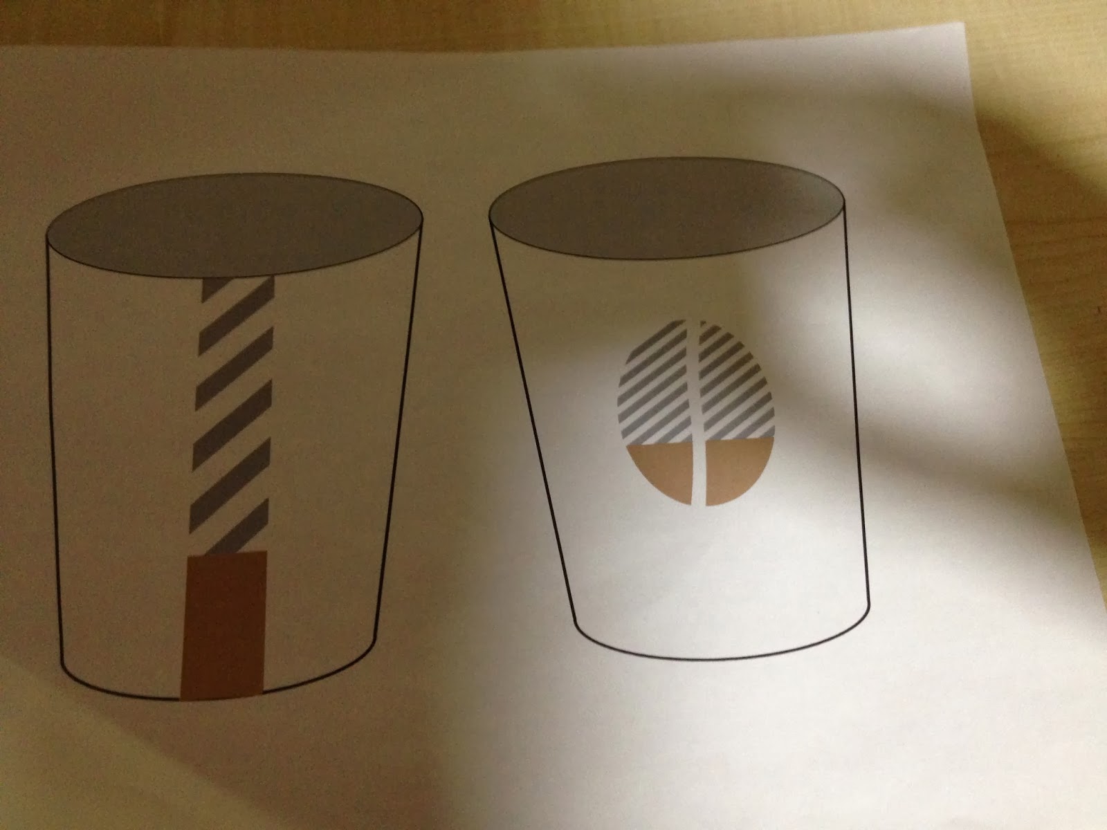
| Because of the constraits of the brief, I thought best to not use this opportunity to create a menu but, a booklet that can be used alone or alongside a menu I would later design. |
 |
| I presented this in a crit with only positive feedback, the typeface was said to be 'fitting of a contemporary coffee shop'. |
 |
| I began to become excited at the idea of branding and began to rush into product design. |
 |
| My justification of using Gotham was not only because of its simplistic F and E's as well as the modern diagonal opening to its open counter but its denotations of independence and sophistication. The outline created using gotham adds to this simplistic manner I am attempting to achieve as it is the concept of my shop. |
 |
| The reasoning behind the layer behind the filled type is in relation to the key above. The brown (coffee) sits above the grey diagonal lines (milk) to create a latte. |
 |
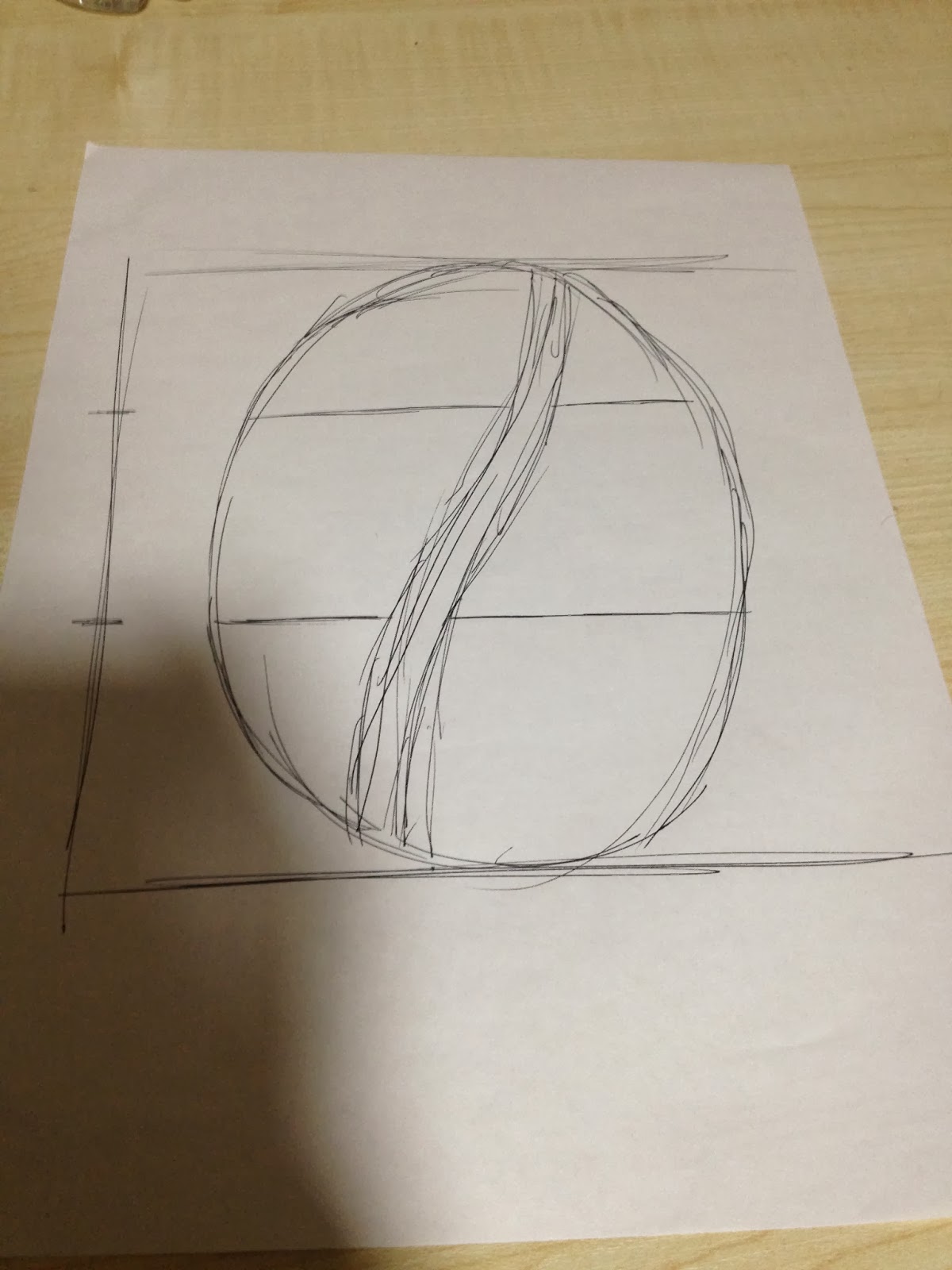
| Replacing the 'O' with a bean seemed to create a basic logo, the manipulation of an oval to a circle didn't create nice results. |
 |
| The final logo. |
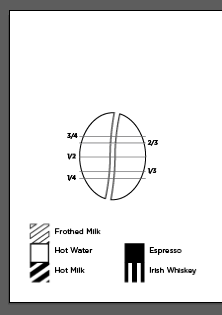 |
| I have decided to only use black. The use of colour was unnecessary as information can be clearly displayed without. I designed the key above which I believe is legible with ease. The use of one colour also increases the possibility of screen printing which would add to the aesthetics and mood of my independent coffee shop. |
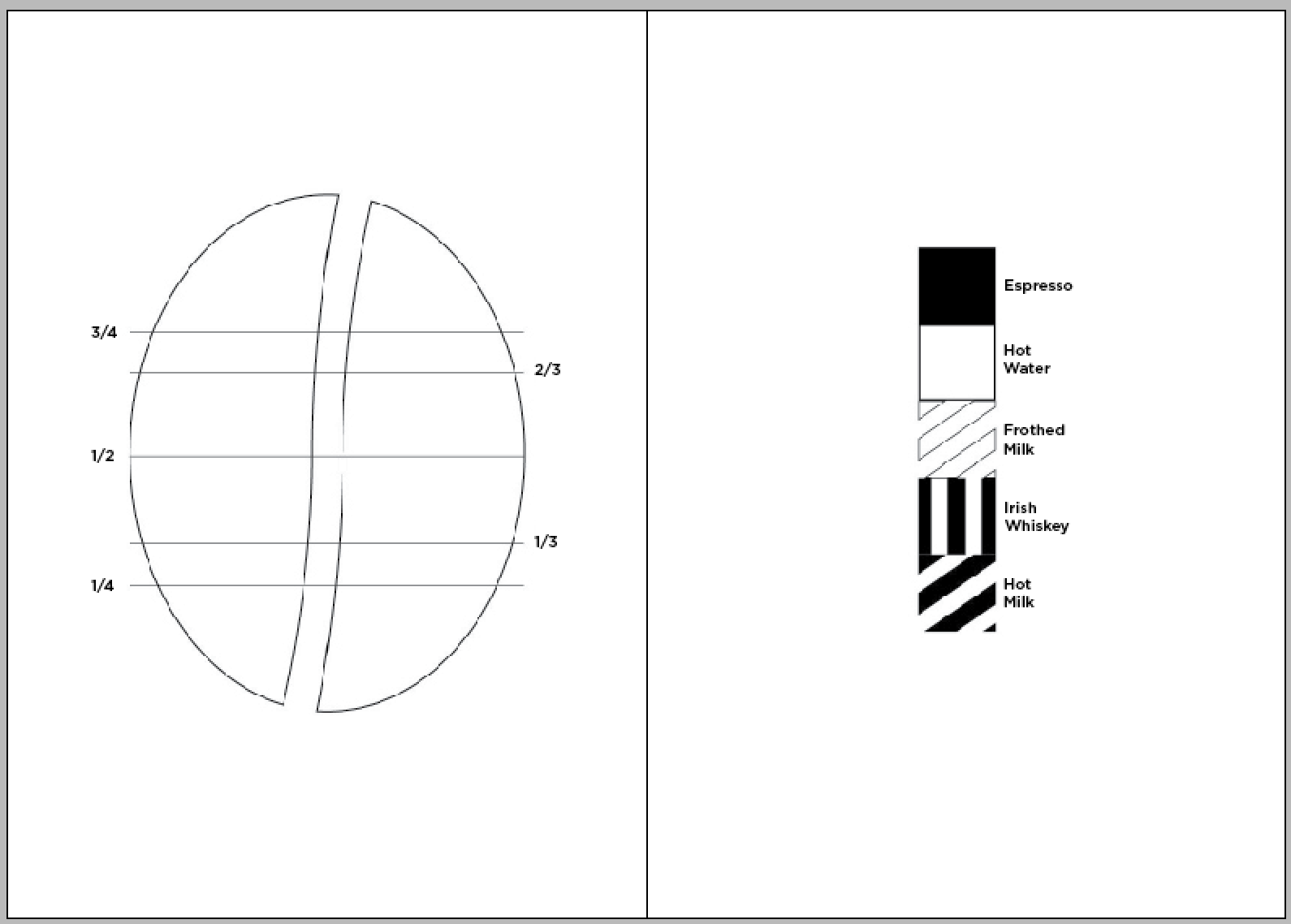 |
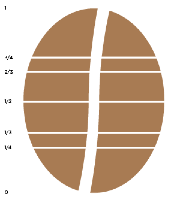
| The key DPS, a scale on the left and the key on the rights. I have centred the key as to balance the page. Placing anywhere else created a mass of white space which deducted from the image. |
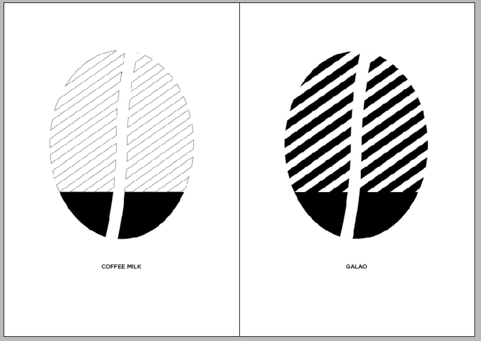 |
| The info graphic and name of the coffee. There is nothing else needed on the page as it communicates the concept, to inform simplistically. |
 |
| I had used 24pt gotham here, along with the clearness of uppercase, the type seemed too aggressive and has been reduced to 12pt here below. |
 |
| Inspired by Ram's Less but more, I wanted to use black on white with a distinctive grid. This way my favourite layout as it seemed pleasing to the eye as being balanced by the contrast of pt size. |
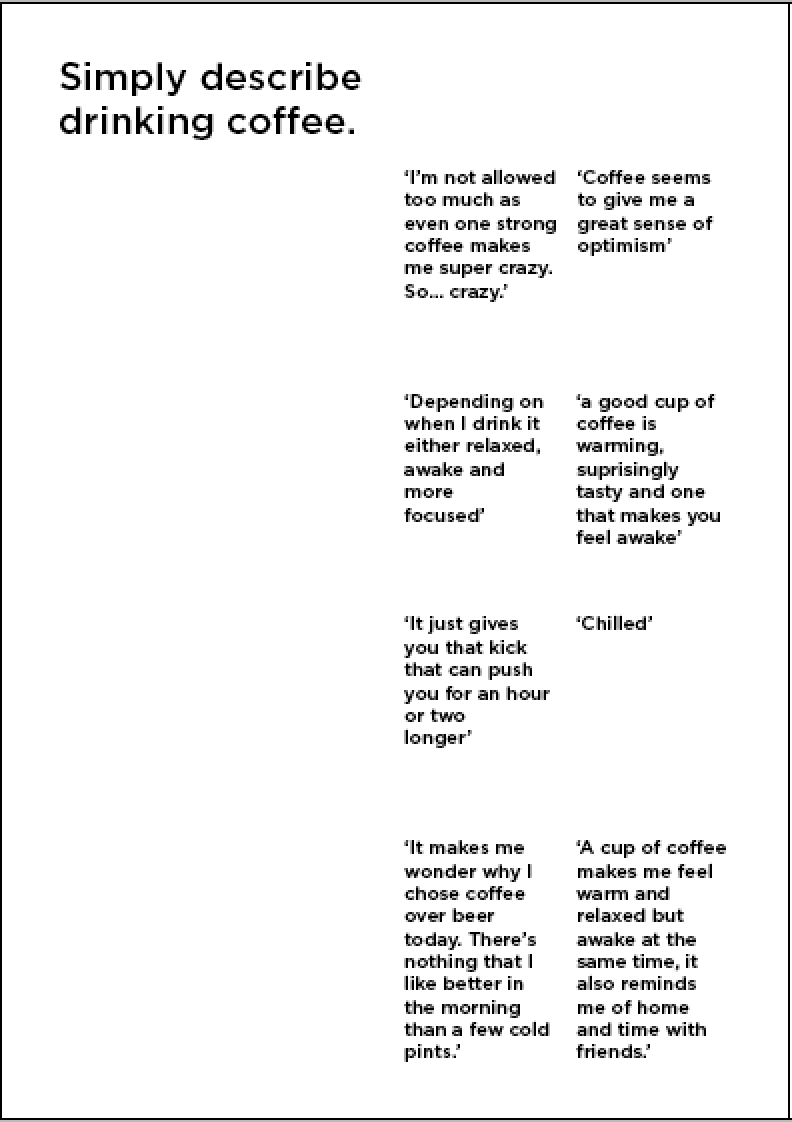 |
| This layout similar to the one used in Rams's book did not work with my content of a list of quotes. |


